


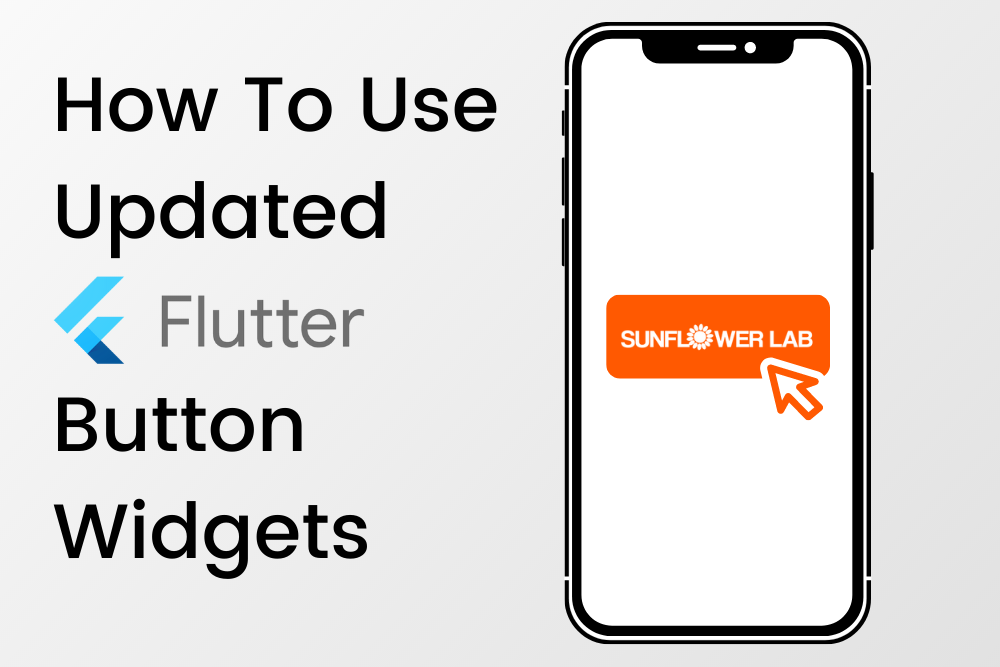
Flutter has released new button widgets for mobile app developers. Who wants to forget about RaisedButton, FlatButton, OutlineButton which provides a simple way to add buttons with or without icon on a screen for our mobile applications? To simplify it, Flutter has updated these all these to ElevatedButton, TextButton, OutlinedButton respectively with parameter as well as styling option updates. Let’s see them one by one.
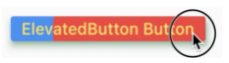
ElevatedButton
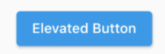
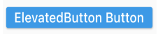
Same as RaisedButton, this widget puts button with elevation on the screen. Required parameters are same, child, onPressed. Child will accept widget to be displayed on button, onPressed will accept a VoidCallBack to be called when a button been pressed/touched.
ElevatedButton(
  child: Text('Elevated Button'),
  onPressed: () {
    	log('Elevated button clicked');
  },
)
Having same code which we used for RaisedButton we can have same representation with ElevatedButton.
Now let’s talk about another replacement, TextButton.
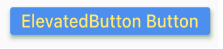
TextButton
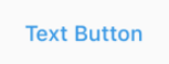
This one is an alternative of FlatButton, which we’re be using where a tapped action needs to be provided for Text being displayed on screen without any border, elevation or fancy decoration. Required parameters are same child and onPresseed.
TextButton(
  child: Text('Text Button'),
  onPressed: () {
    log('Text button clicked');
  },
),
Button will be displayed as shown below.
Let’s talk about last, replacement if OutlineButton.
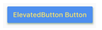
OutlinedButton
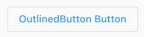
We were using OutlineButton to display a tap action on screen with outline border, without filling area occupied inside this outline border. Required parameters are same, child and onPressed.
OutlinedButton(
  child: Text('OutlinedButton Button'),
  onPressed: () {
    log('OutlinedButton button clicked');
  },
),
Button will be displayed as shown below.
So, these was the basic details of replacement of button widgets available in Flutter to display different type of buttons for out mobile applications.
Additional Note
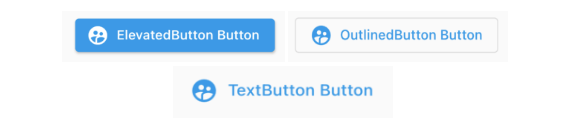
Button with icon which we’re using earlier are same with these updated widgets as well. To have an elevated button with icon use ElevatedButton.icon widget and pass required parameters. Same for outlined button and text button, use OutlinedButton.icon, TextButton.icon respectively. Below are the representations how they will look.
Next, now let’s talk about styling.
Styling
Styling can be provided to content being displayed on button and as well as to button itself. Previously, we were having different parameters at individual button level to decide different styling properties, but now this can be done by giving a value of ButtonStyle class to style parameter of these updated material buttons. Let’s check them out one by one.
Note: This all property works same for TextButton and OutlinedButton as well. For simplicity, only ElevatedButton is represented in further article.
textStyle
This will define styling of text being displayed on button. It accepts a value of TextStyle class to provide text styling options via MaterialStateProperty. See below.
textStyle: MaterialStateProperty.all<TextStyle>(
  TextStyle(
    fontSize: 24.0,
    fontWeight: FontWeight.w500,
  ),
),
Colors (backgroundColor, foregroundColor, overlayColor, shadowColor)
These options are available to have required color for specific place.
- backgroundColor : for button background.
- foregroundColor : for content being displayed on the button.
- overlayColor : for ripple being displayed when tapped or long pressed.
- shadowColor : for shadow of the button when elevation is greater than 0.
All of these options, accepts value of Color class via MaterialStateProperty. See below code.
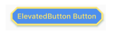
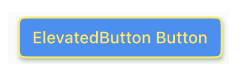
backgroundColor: MaterialStateProperty.all<Color>(
  Colors.blueAccent,
),
foregroundColor: MaterialStateProperty.all<Color>(
  Colors.yellow,
),
overlayColor: MaterialStateProperty.all<Color>(
  Colors.red,
),
shadowColor: MaterialStateProperty.all<Color>(
  Colors.green,
),
elevation
To provide z index height (elevation) to button we can assign any positive value to it.
elevation: MaterialStateProperty.all<double>(5.0),
padding
To give spacing between button border and content being displayed above it this property can be used. It accepts value of EdgeInsets via MaterialStateProperty.
padding: MaterialStateProperty.all<EdgeInsets>(
  EdgeInsets.symmetric(
    horizontal: 20.0,
    vertical: 15.0,
  ),
),
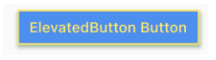
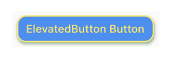
side
Using this parameter we can even customize border of a button being displayed on the mobile screen. Pass value of BorderSide class via MaterailStateProperty as below and see changes.
side: MaterialStateProperty.all<BorderSide>(
  BorderSide(
    color: Colors.yellow,
    width: 3.0,
  ),
),
shape
This parameter is an interesting one as it gives us so many options to be used to have different shapes for a button. See options below,
BeveledRectangleBorder
shape: MaterialStateProperty.all<OutlinedBorder>(
  BeveledRectangleBorder(
    borderRadius: BorderRadius.circular(20.0),
  ),
),
ContinuousRectangleBorder
shape: MaterialStateProperty.all<OutlinedBorder>(
  ContinuousRectangleBorder(
    borderRadius: BorderRadius.circular(20.0),
  ),
),
RoundedRectangleBorder
shape: MaterialStateProperty.all<OutlinedBorder>(
  RoundedRectangleBorder(
    borderRadius: BorderRadius.circular(20.0),
  ),
),
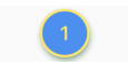
Circle Border
shape: MaterialStateProperty.all<OutlinedBorder>(
  CircleBorder(),
),
See, this is how this shape parameter changes shape of a material button with different representations.
So, these are all what we have for updated Flutter material buttons. We hope you learned something new! Stay tuned for our next how-to article.
Get a FREE quote on your project today!
Your idea is 100% protected by our Non-Disclosure Agreement
Related Posts
10 Types of Power BI Dashboards for Every Industry!
Explore the different types of Power BI dashboards and learn how to transform your data into smart insights.
Improve Business Operations with Power Portal and Power Pages
Benefit from Power Portal and Power Pages to help your business using external facing websites and improving accessibility with security.
Why Organizations Need an RPA Strategy
Having an RPA strategy will help you avoid wasting time, clearly define your goals, and scale automations in the future.
You might also like
Stay ahead in tech with Sunflower Lab’s curated blogs, sorted by technology type. From AI to Digital Products, explore cutting-edge developments in our insightful, categorized collection. Dive in and stay informed about the ever-evolving digital landscape with Sunflower Lab.


