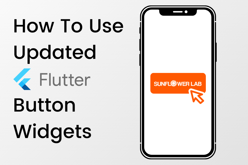
flutter button widget
resources ⸻


From Ideation To Support, We Partner With You All The Way
Contact our team of experts today!
resources ⸻
Contact our team of experts today!
it’s time to turn your ideas into reality. Let us work with you from ideation to deployment.
Partnered with Global brands to startup
