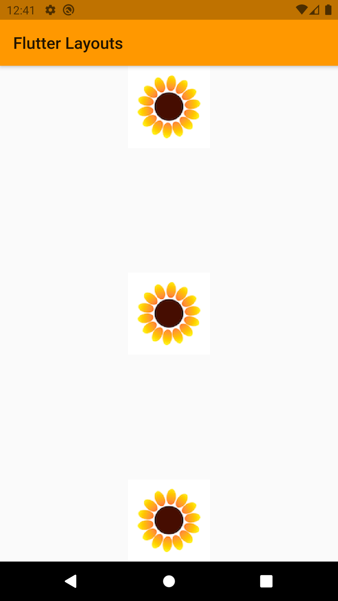
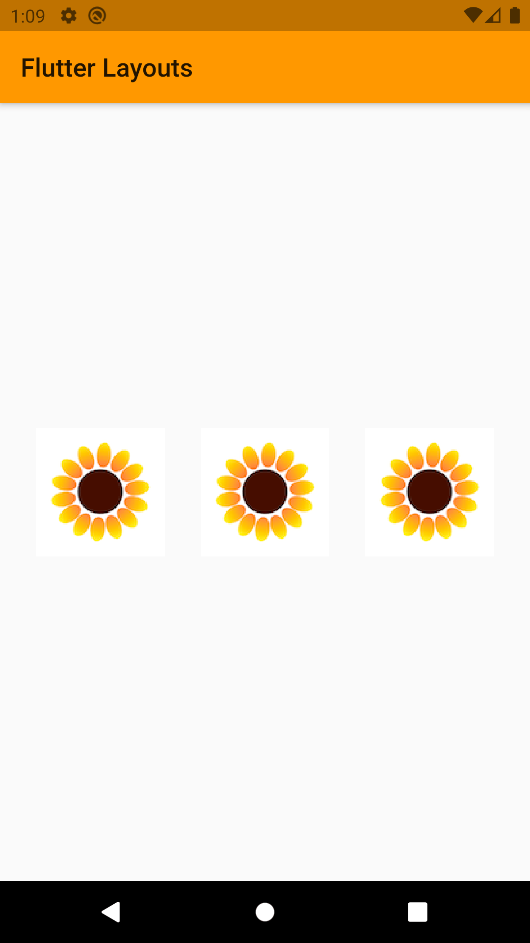
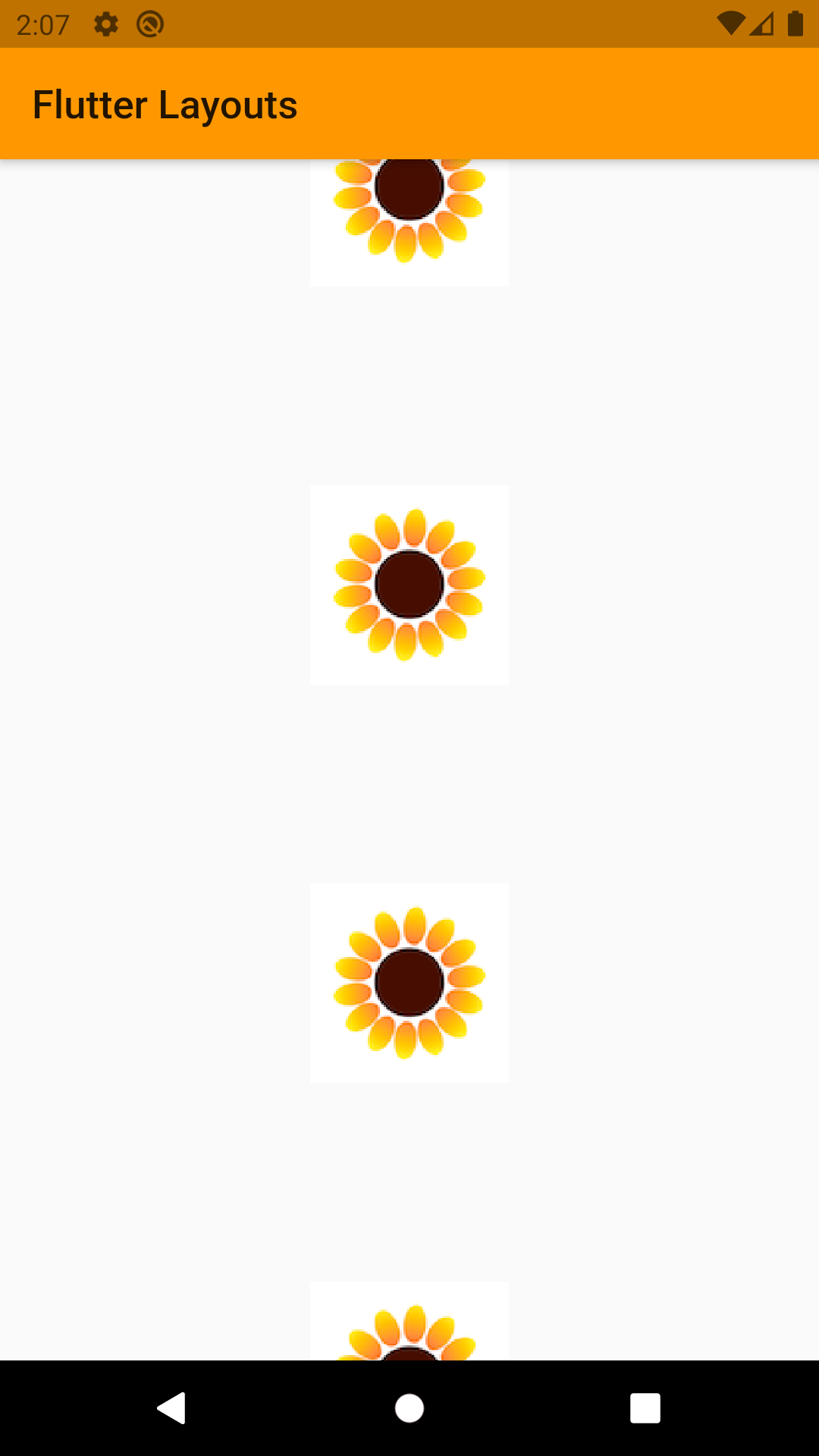
So far, into Flutter Fundamentals we’ve looked at the single child widget. At this point, you must be thinking, “Wow, Flutter is so easy! Everyone should be using it!” That is only partially true, because things are going to start getting a little more complicated. Let’s take a look at Multi child layout widgets. Multi child layout widgets are those who can have more than one widget as their children. One of the most basic widgets of them is Column.
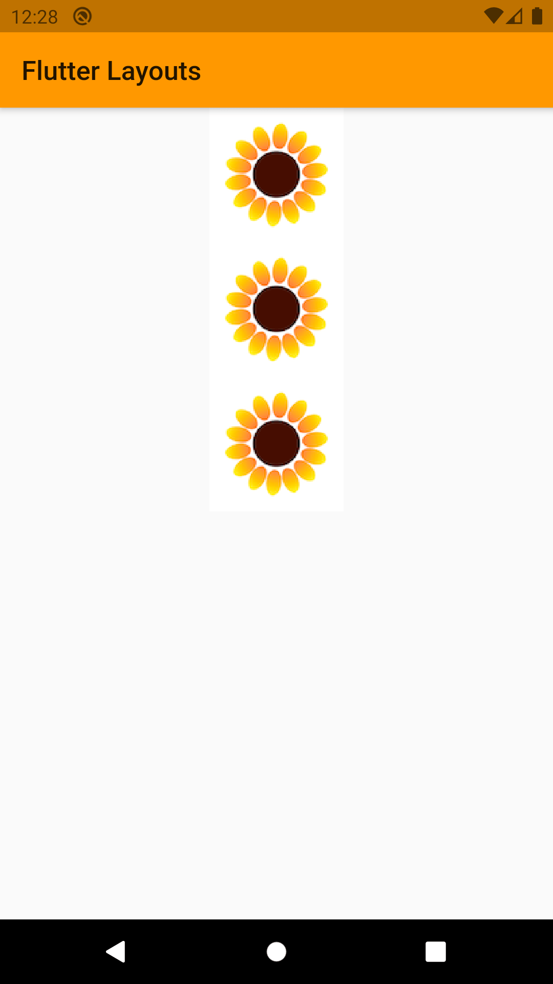
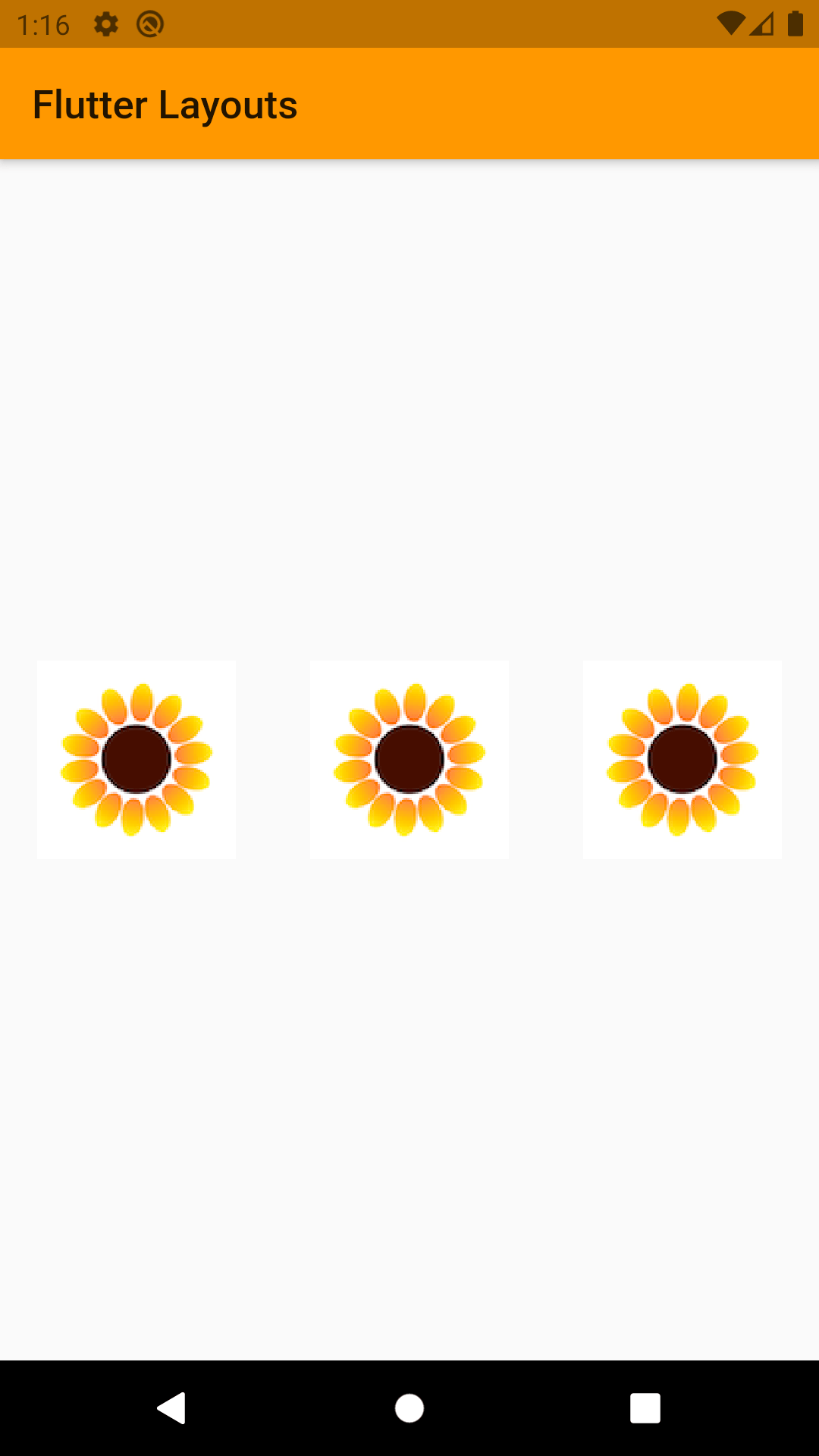
Column
What column does is create an array of its child and position them one after other in a vertical way. Hence the main axis for the column would be the Y-axis or the vertical axis. And the Cross axis would be the X-axis or the vertical axis.
If you don’t cap the main axis with help of other widget then main axis would be taken as infinity. And this might cause some problems. Because you might see a blank screen and don’t know what the problem is.
If you are thinking that I would just scroll around, here is a thing column by default isn’t scrollable. If you want to scroll it you will need to use some other widgets.
Properties:
- children: Any Widgets (Notice that it has children property instead of child.)
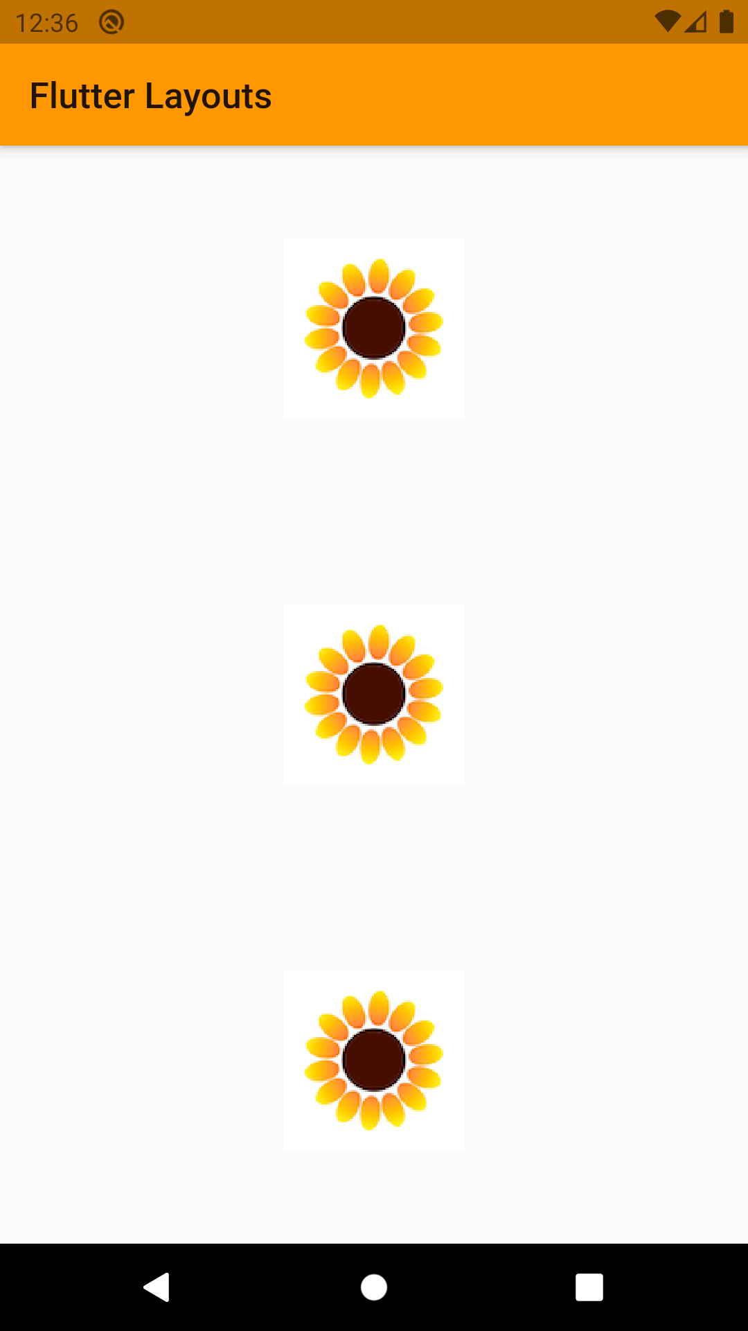
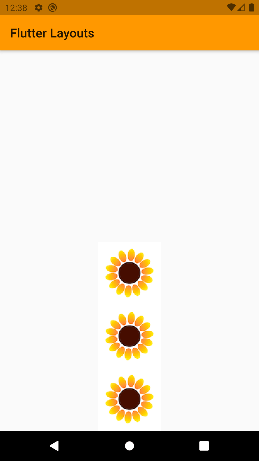
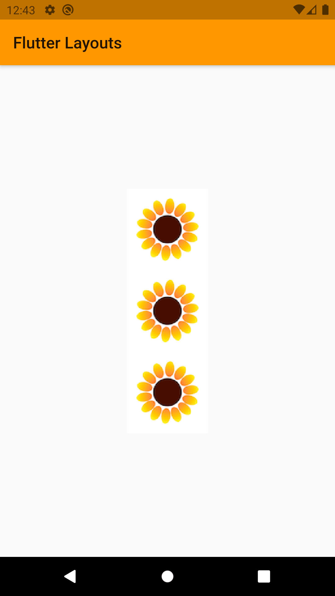
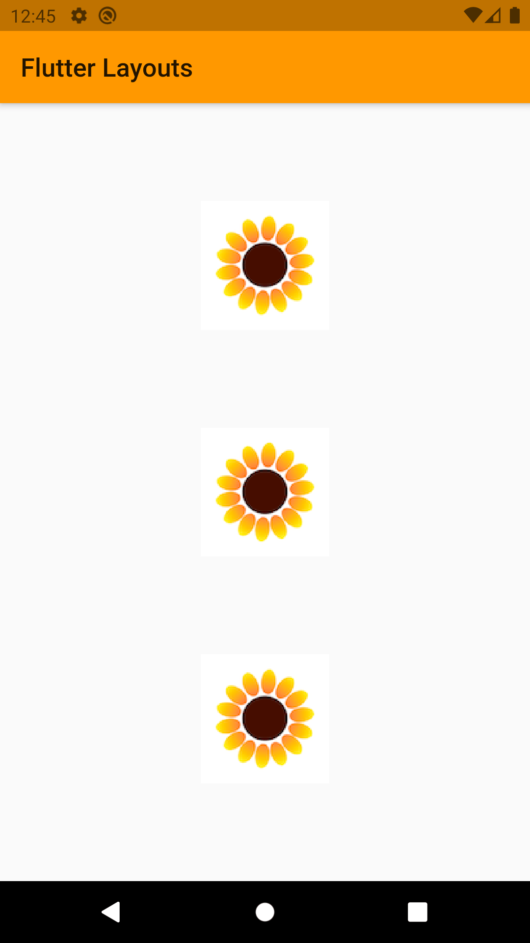
- mainAxisAlignment: Decided how children widgets would be placed on main axis. This property has a few options.
- MainAxisAlignment.start: Position all children at start.
- MainAxisAlignment.end: Position all children at the end.
- MainAxisAlignment.center: Position all children in middle.
- MainAxisAlignment.spaceBetween: leave space between the children.
- MainAxisAlignment.spaceEvenly: Leave even space around and between all children.
- MainAxisAlignment.spaceAround: Leave even space around the children.
- crossAxisAlignment: Decides how children would be placed on cross axis. This has some of option we have seen in mainAxisAlignment.
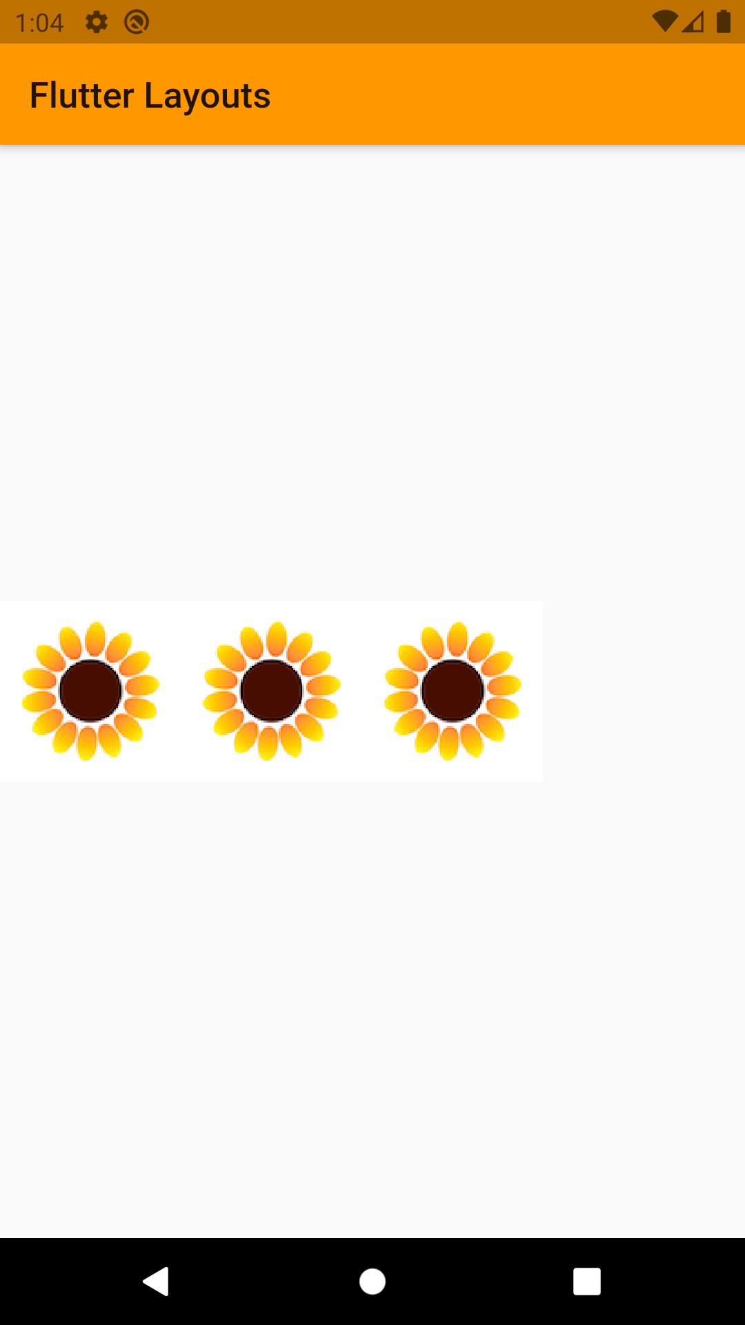
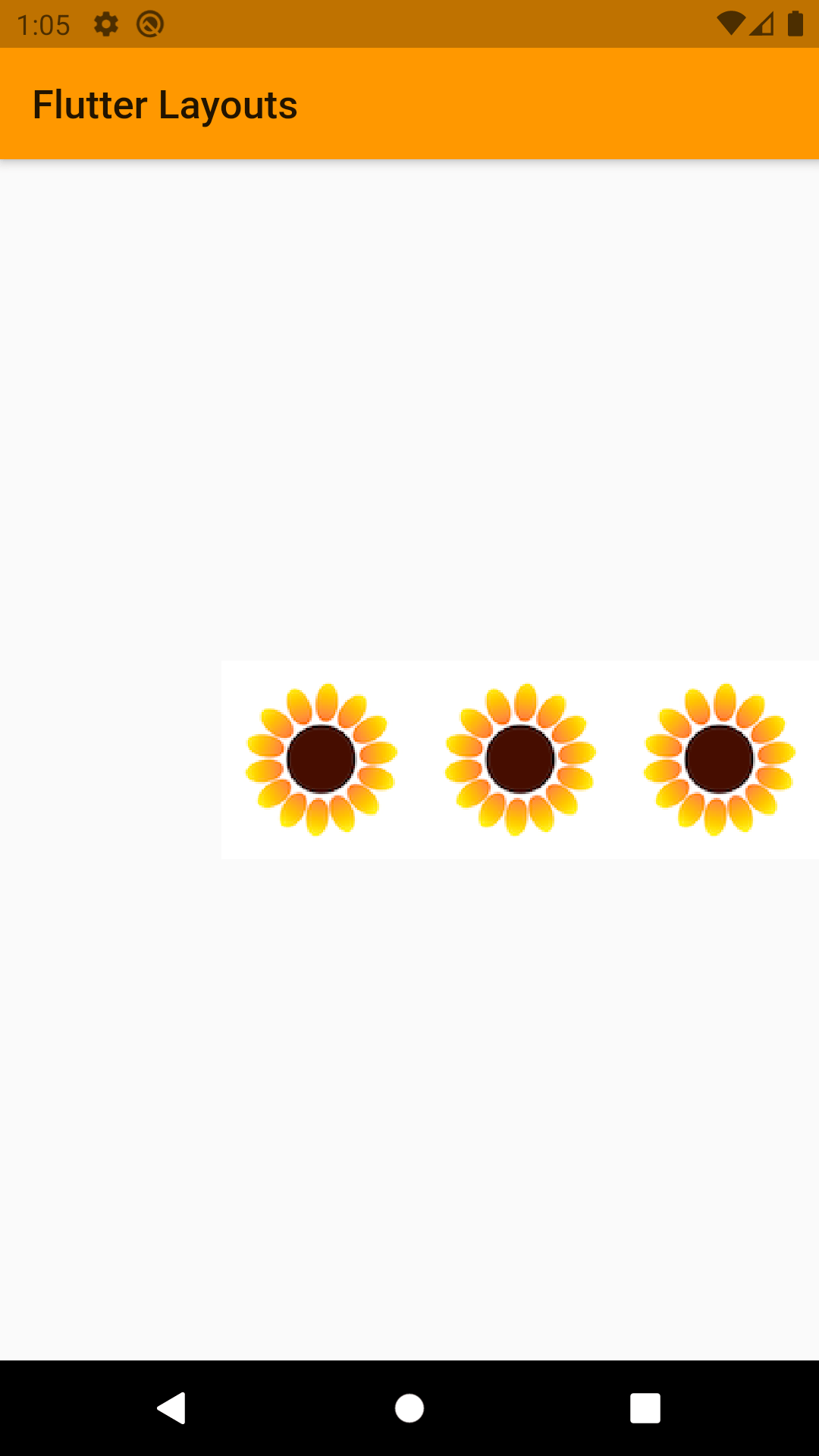
Row
Row is basically same as column but instead of placing its children vertically, Row would place its children horizontally. So main axis and cross axis are switched for row. It has all the same properties that a column has.
- children: Any Widgets.
- mainAxisAlignment: Decided how children widgets would be placed on main axis. This property has a few options.
- MainAxisAlignment.start: Position all children at start.
- MainAxisAlignment.end: Position all children at the end.
- MainAxisAlignment.center: Position all children in middle.
- MainAxisAlignment.spaceBetween: leave space between the children.
- MainAxisAlignment.spaceEvenly: Leave even space around and between all children.
- MainAxisAlignment.spaceAround: Leave even space around the children
- crossAxisAlignment: Decides how children would be placed on cross axis. This has some of option we have seen in mainAxisAlignment.
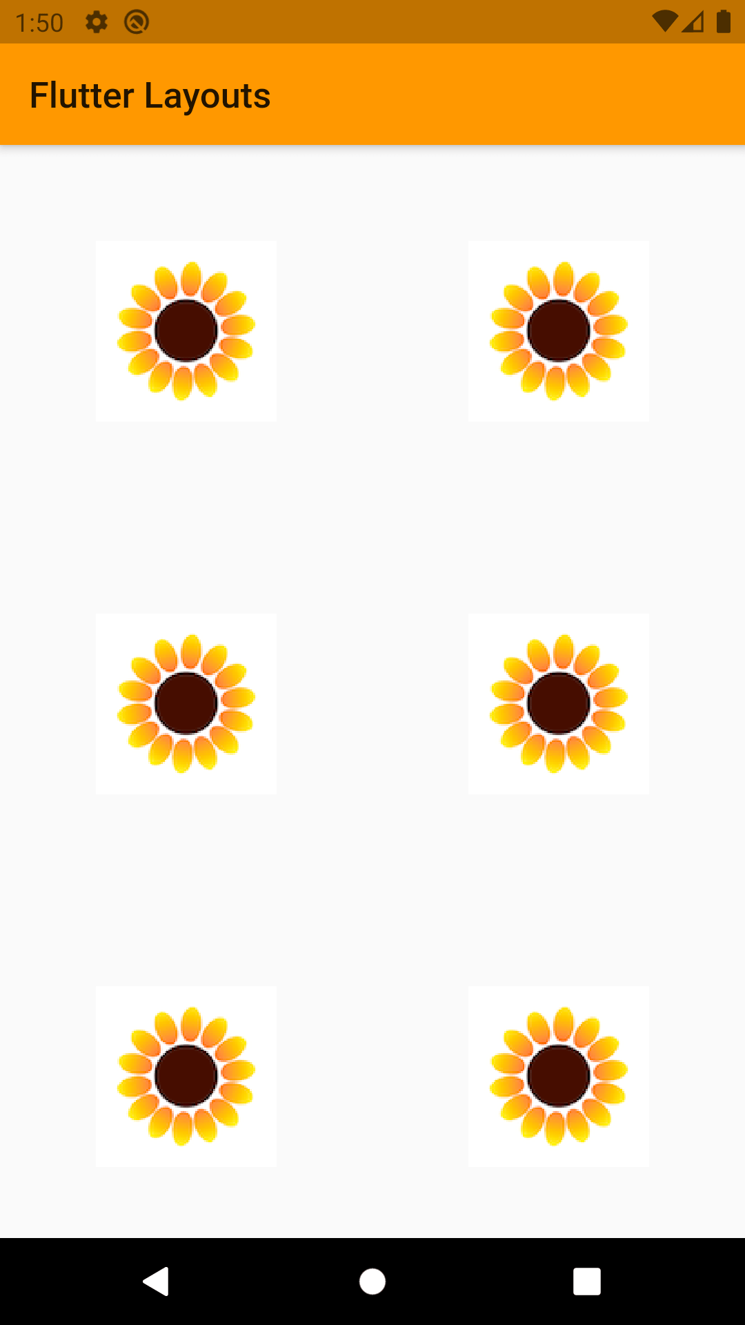
GridView
We have seen row and column till now, the easiest way to explain GridView is, row and column both are 1D (Dimension), while GridView is 2D array.
Instate of cross axis and main axis alignment grid view takes main axis and cross axis spacing. It would decide how much space will be left between its children.
We can implement GridView in various ways in Flutter:
- GridView.count()
- GridView.builder()
- GridView.custom()
- GridView. Extent()
GridView.count() is one which is used frequently and it is used when we already know the size of Grids. Whenever we have to implement GridView dynamically, we use GridView.builder(). Both are just like a normal array and dynamic array. In Flutter, the two GridView is mostly used.
GridView.count() is used with some named parameters. The properties that we can use are: crossAxisCount: It defines the number of columns in GridView.
- crossAxisSpacing: It defines the number pixels between each child listed along the cross axis.
- mainAxisSpacing: It defines the number of pixels between each child listed along the main axis.
- padding: It defines the amount of space to surround the whole list of widgets.
- primary: If true, it’s ‘Scroll Controller’ is obtained implicitly by the framework.
- scrollDirection: It defines the direction in which the items on GridView will move, by default it is vertical.
ListView
The easiest way to define ListView is scrollable column. It is the most commonly used widget in the flutter app development.
There are 2 main ways to use or create ListView.
- As widget as regular column: Mostly used with static or known number of data.
- Build method (ListView.build): Will create a ListView dynamically.
TableView
Table widget is used to display items in a table layout. There is no need to use Rows and Columns to create a table. If we have multiple rows with the same width of columns then Table widget is the right approach.
Properties:
- border: to style how borders will look inside the table.
- children: Any Widgets.
- columnWidth: Decided width of the column.
Wrap
Wrap works similar to a row or column based on mainAxis property given to this widget. But instead of showing error when they run out of space it will wrap the rest of the children widget into next row or column.
Properties:
- children: any widget.
- maniAxies and crossAxies alignment: same as row and column.
So, this is what flutter provide us as multi child layout widgets. Happy coding!
Get a FREE estimate for your project today.
Our team of experts will review your project and give you a quote at no cost.
Related Posts
Top-Down vs Bottom-Up: Which Automation Approach Should You Choose?
With over 78% companies implementing RPA, it’s time you give it a thought too and to guide you through it, we have a rundown of two…
Top 5 Power BI Hiring Mistakes to Avoid
Building a robust analytics team is essential for modern businesses. Power BI, a powerful data visualization and business intelligence…
You might also like
Stay ahead in tech with Sunflower Lab’s curated blogs, sorted by technology type. From AI to Digital Products, explore cutting-edge developments in our insightful, categorized collection. Dive in and stay informed about the ever-evolving digital landscape with Sunflower Lab.


