SECTION. 1
It’s been couple of years since react-native has taken hive in Mobile App Development world. Based on JavaScript, react-native gives you a way to write your whole mobile application in single code base language, and allows you to release a Mobile Apps for two different platforms: iOS and Android.
Build with best part of native development with React and written in JavaScript, it’ll help software developers to bring the best of their knowledge for mobile app development as good as made with native app development. React-native has also introduce many components that you can term as views that can be used to build a cross-platform mobile application. This component behaves differently based on the platform on which they are running. Like an Alert component, which looks differently on both the platform as their native behaviour, but it’s coded in single code base. But what if we need to design a component that looks the same, works the same, and responds the same on both platforms (Android, iOS)?
Here in this article, we’re going to discuss how we can design a custom component that looks the same and behaves the same for iOS and android platforms. We’re going to design a Custom Alert Component that will have an alert title, alert title image, alert message, and two buttons from which user can respond back (OK, CANCEL, YES, NO). So, let’s start with it.
First, we’ll create a new react-native project using specific version of react-native,
react-native init CustomAlertComponent –version 0.59.4
Execution of this command will take some time. At the end of the execution, open our application project in Visual Code or any other code editor to go further.
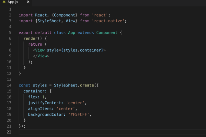
Initially we’ll have entry level structure of react-native application and we’ll go with this one. As we can see, index.js have a registered component declared in App.js file. We’re going to work with this file. So next open it and remove the unnecessary content from it. At end the content of file should be as below,
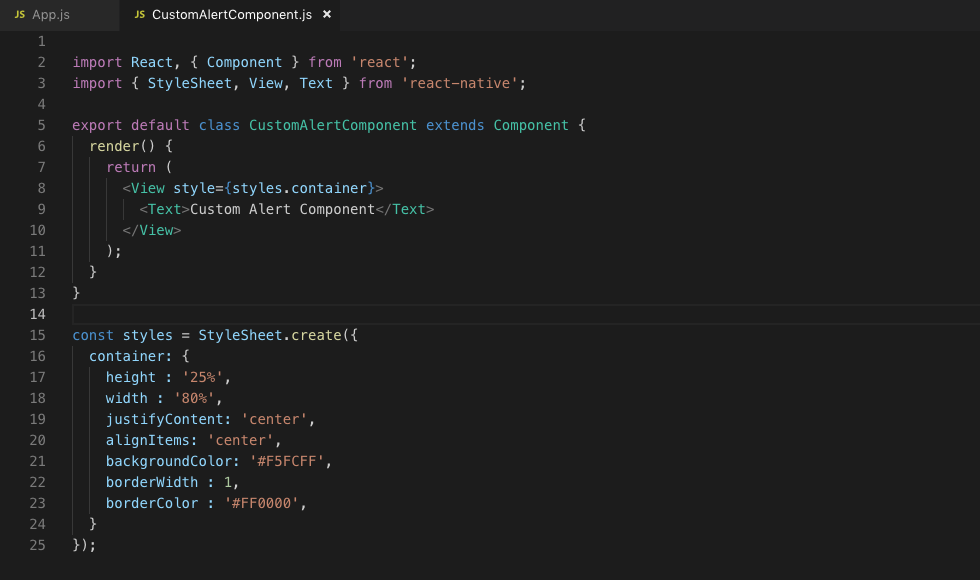
Next, we’ll create our custom alert component. For that we require a separate CustomAlertComponent.js file. So, copy and duplicate App.js file and simply change the name of the file and class to CustomAlertComponent. Modify the content as shown in below image.
Next, we slightly modified our main App.js file as below.
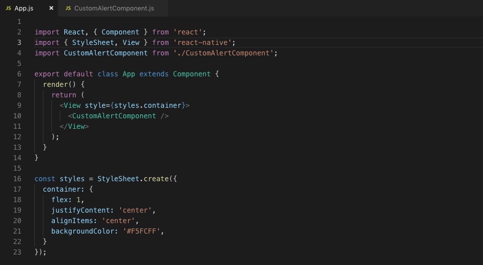
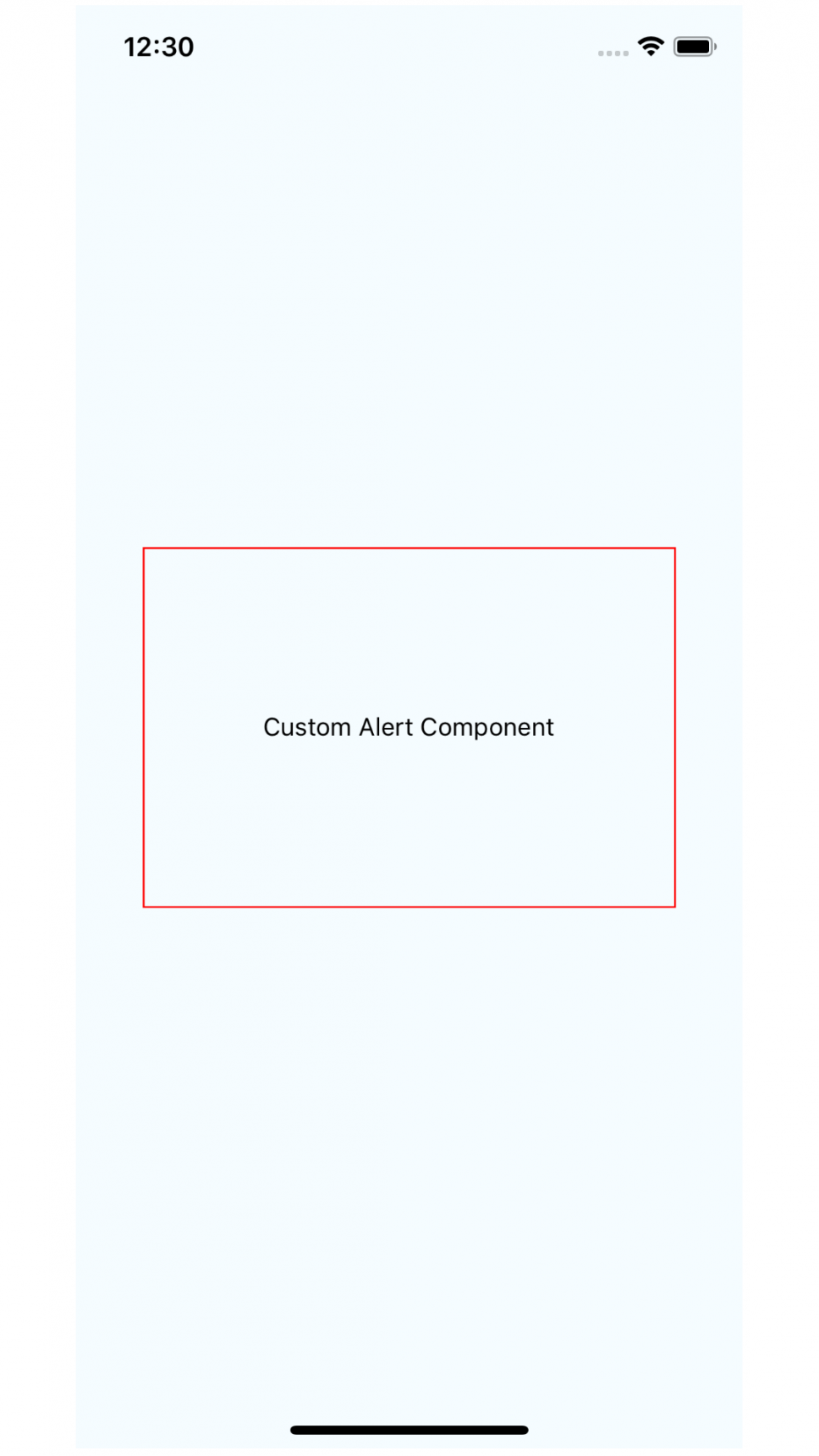
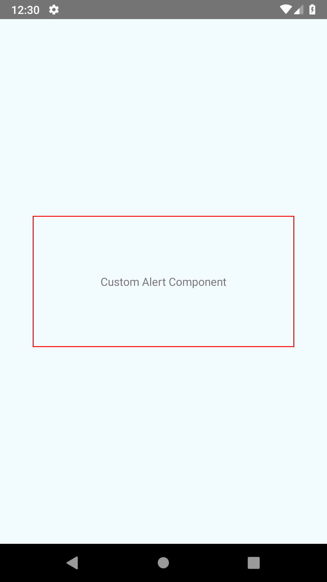
Change that we’ve made are, first import CustomAlertComponent that we have created and put it in between <View/> tag of the render method. Now, let’s run the application using react-native run-ios (for iOS) or react-native run-android (for Android) command. We’ll get results as below images. We’re keeping it visible so we can see how our designing takes place with time.
Now we’ll design our CustomAlertComponent which contains components/views as below structure,
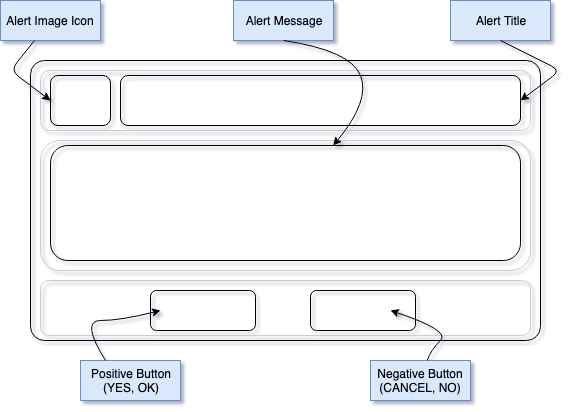
Views in this custom component are listed here:
- Alert Image icon
- Title of alert
- Alert message to be displayed
- Positive button (like ‘OK’, ‘YES’)
- Negative Button (like ‘CANCEL’, ‘NO’)
Now let’s start designing this structure. As we can see our CustomAlertComponent contains views in one column where first row contains Image Icon and Alert message title, second row contains Alert Message and third row contains Positive and Negative button side by side. So, let’s start implementing it.
Modify CustomAlertComponent file as shown below.
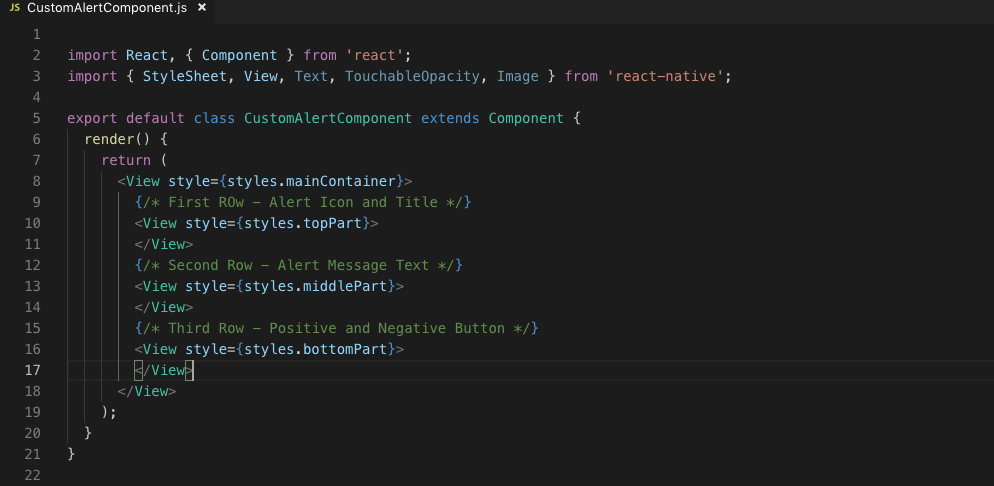
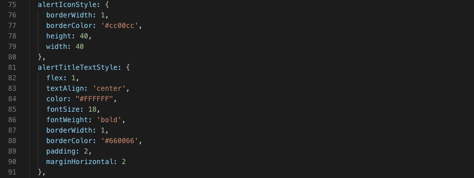
Here, we have defined three separate views as requirement of our design. Each view has its own style as shown below defined in styles section of the same file.
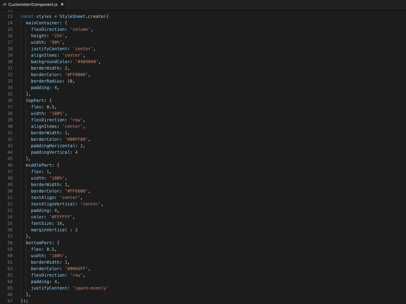
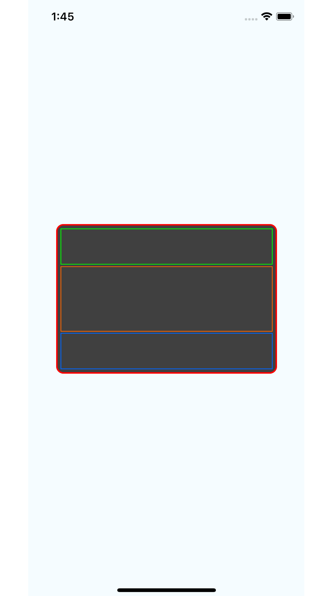
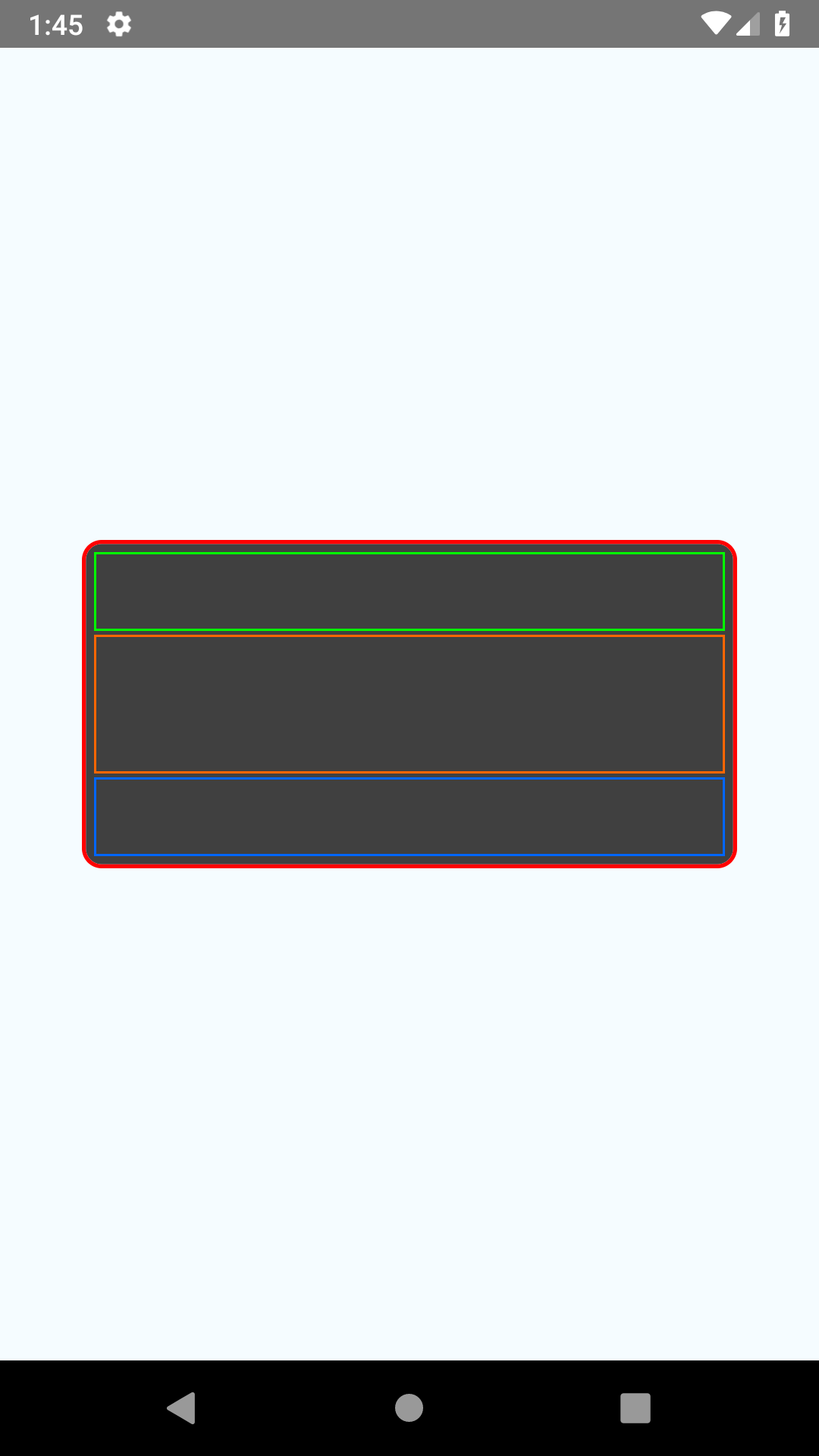
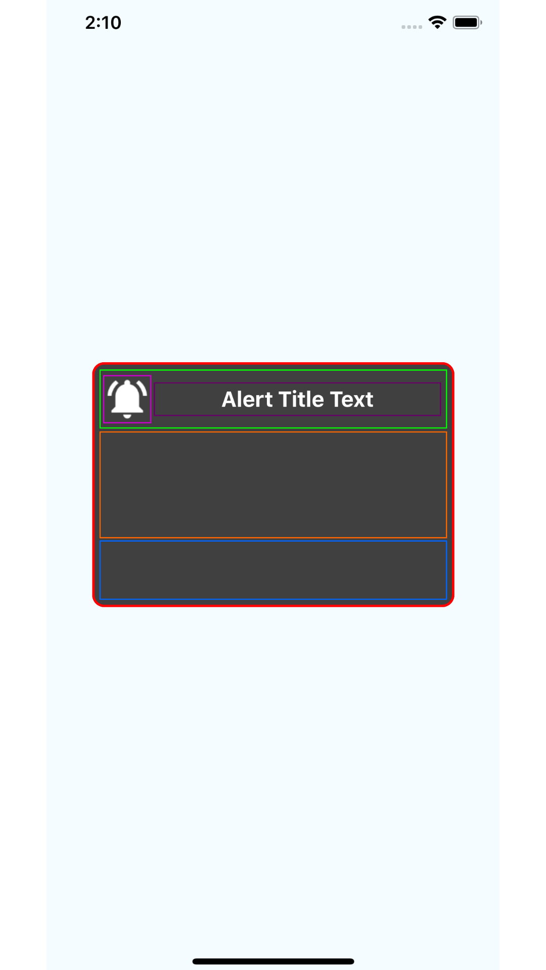
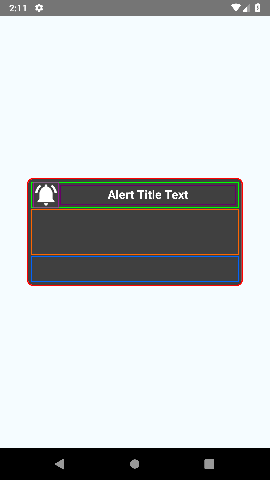
Let’s find out how it works. We have three views sitting on top of view coming after it. So, we’ve declared flexDirection style property with value column for our mainContainer. Now Views inside the container will render in a single column. We also have change backgroundColor of our mainContainer. When we done with the changes, we’ll have results as below screens.
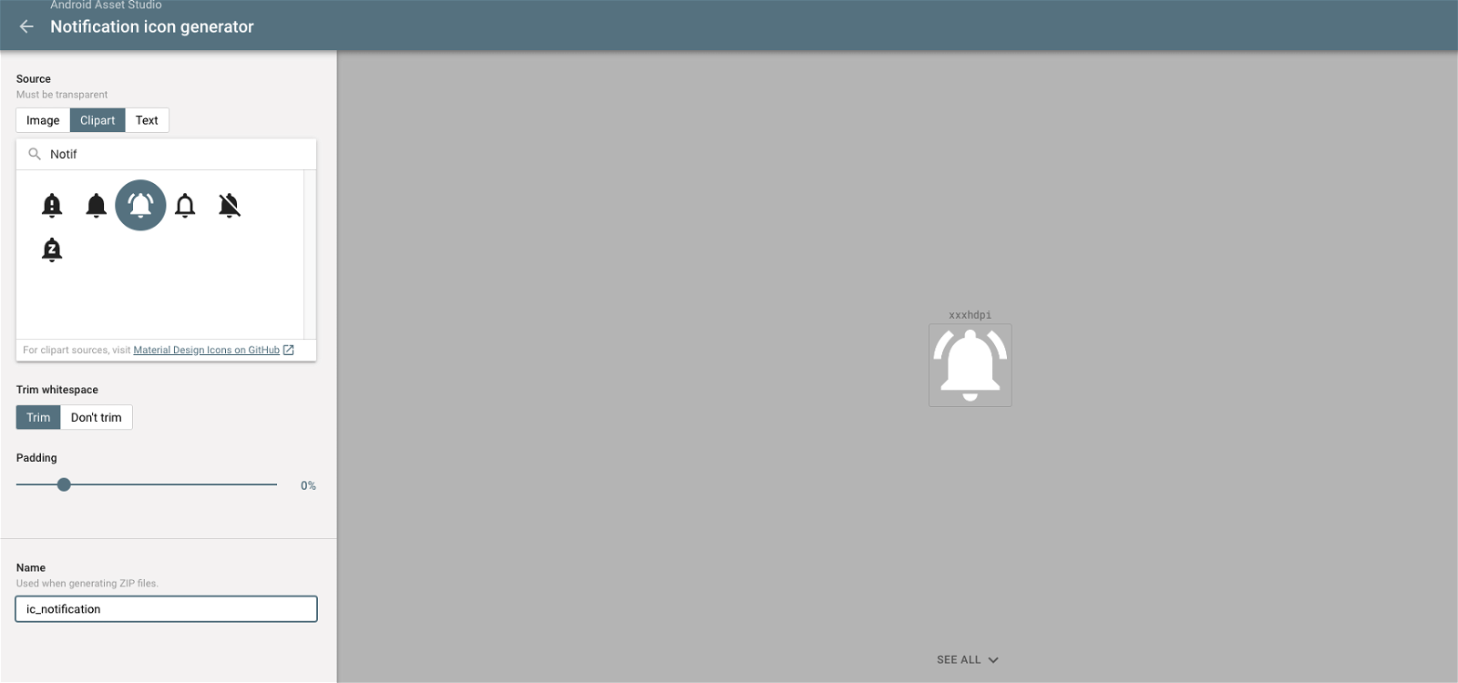
Next, we’ll design each row one by one to get design our final structure. For the first row, we require an image icon to display. So, go to Android Assests Studio HERE. Select a clipart (like notification as below image) and give a proper name of it like ic_notification and download zip file.
Extract this zip file somewhere and copy icon file from drawable-xxhdpi folder. Next, create a folder in our application name it images and paste that file inside of it. We’ll display this icon as alert icon to the left of title for Custom Alert Component.
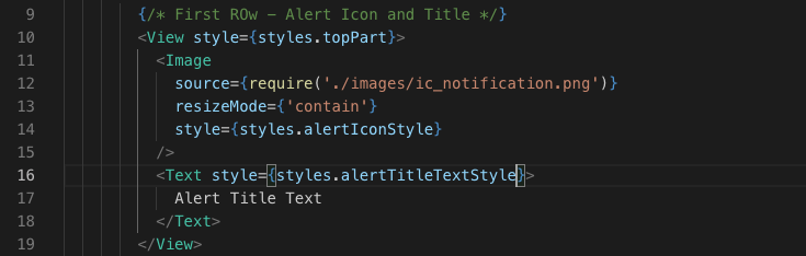
To display it, import Image & Text from ‘react-native’ and do the changes as below for the views and styles that we apply for that Views.
After we make changes, let’s run the application, we’ll see changes as below.
Now, it’s time to add alert message to our designed component. For that inside <View/> component of middle part we will take a <Text/> component as shown in below code.
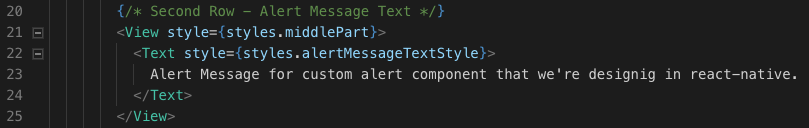
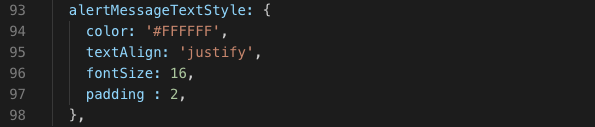
To display alert message with proper format, specify & apply styles for it as shown below.
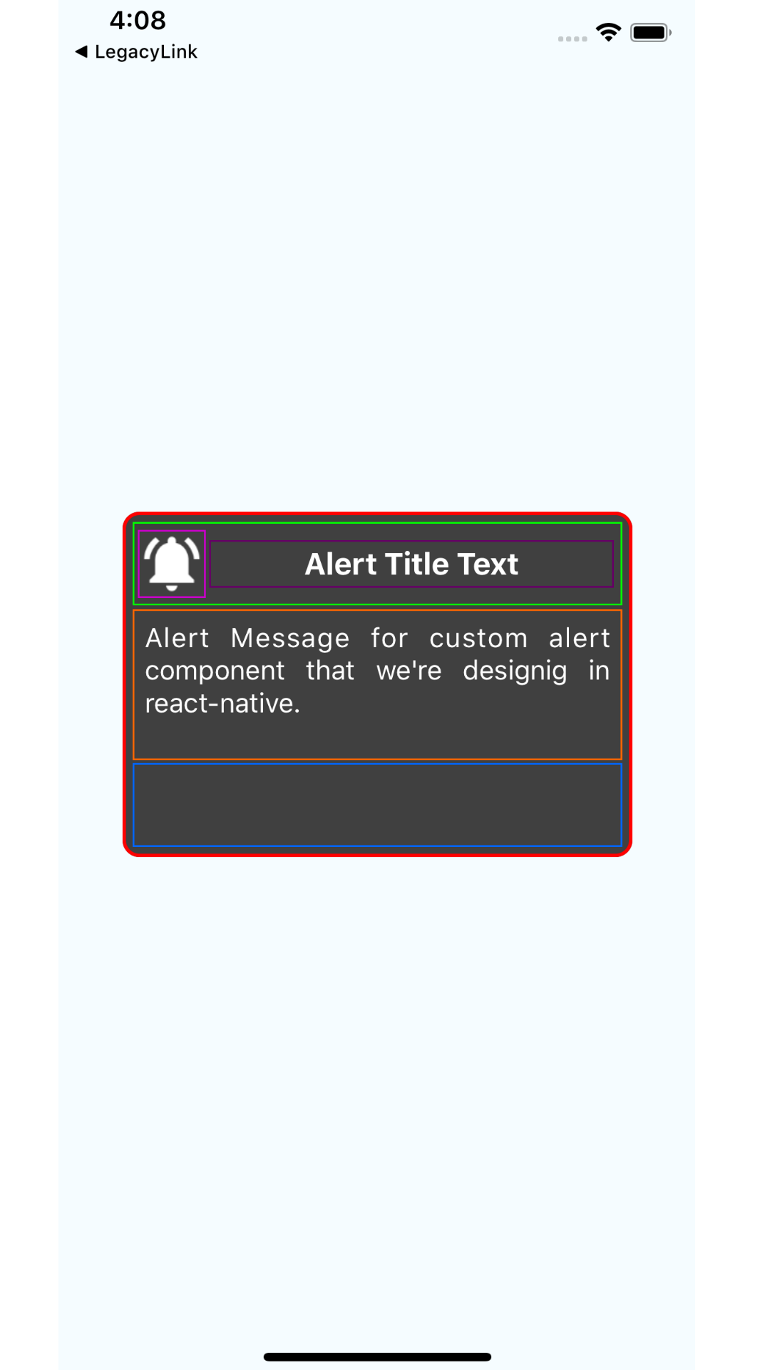
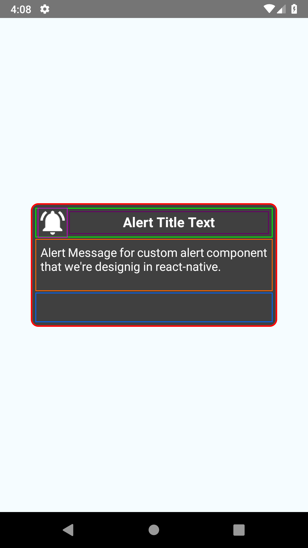
After we make changes, let’s see how they’ve taken effects.
Now we’ll provide two Buttons in the third part of Alert. Among these two one will be the Positive Button (titled with YES/OK) which’ll handle user’s positive action while another will be Negative Button (titled with CANCEL/NO) which’ll handle user’s negative action.
To add these buttons, import TouchableOpacity component from react-native which has onPress method that response to user actions. Now, do the changes as specified as below,
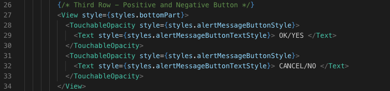
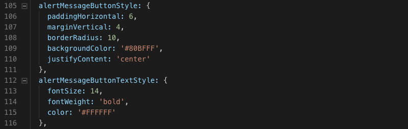
Specified styles for these components and it’s displayed text component as below,
After we done with the changes, let’s see how the changes take effects.
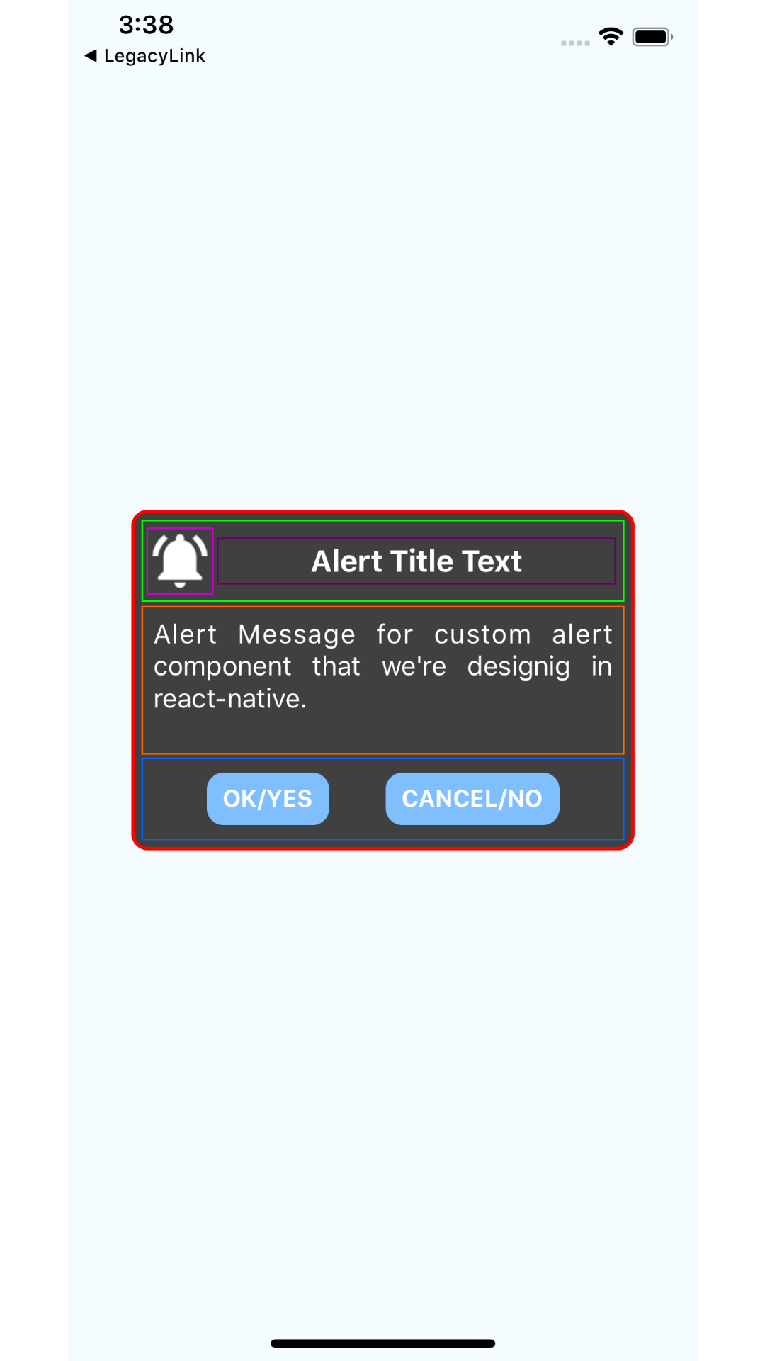
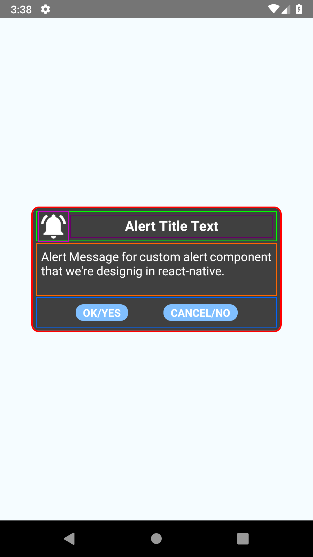
So, this is what our CustomAlertComponent looks with all the details to the user when its prompted. Just do one thing that remove any specified attribute borderColor and borderWidth to any View, Image or Text component and see the changes.
It’s look like our CustomAlertComponent is ready to use but wait, currently it’s displaying static content that we’ve provided but we need that to be dynamic. Dynamic in the sense that we can set what title & message we want to display to the user. Also, we need to specify what action should be performed for positive and negative button clicks. These all the things we’ll see in next part.
SECTION. 2
In previous part, we’ve designed our CustomAlertComponent with static contents. If you haven’t seen that part yet, then check that first.
Now in this part, we’ll make CustomAlertComponent dynamic and for that we have to make use of prop-types. To get them installed run npm intall –save prop-types. Now import PropTypes from prop-types in CustomAlertComponent file. Making custom alert component dynamic gives us ability to,
- Display or hide Alert Image Icon
- Specify Alert Title as require
- Specify Alert Message as require
- Handle respective task for both Positive and Negative button press.
To achieve this all, changes that we require are specified as below,
CustomAlertComponent.propTypes = {
displayAlert: PropTypes.bool,
displayAlertIcon: PropTypes.bool,
alertTitleText: PropTypes.string,
alertMessageText: PropTypes.string,
displayPositiveButton: PropTypes.bool,
positiveButtonText: PropTypes.string,
displayNegativeButton: PropTypes.bool,
negativeButtonText: PropTypes.string,
}
Here we’ve specified propTypes for CustomAlertComponent each as explained below,
- displayAlert: specifies weather alert should be displayed or not
- displayAlertIcon : specify weather alert icon should be displayed or not
- alertTitleText : alert title text
- alertMessageText : alert message text
- displayPositiveButton : specify weather positive button should be displayed or not
- positiveButtonText : displayed positive button text title
- displayNegativeButton : specify weather negative button should be displayed or not
- negativeButtonText : displayed negative button text title
Now to make this effect, surround our <Image/> component as shown below,
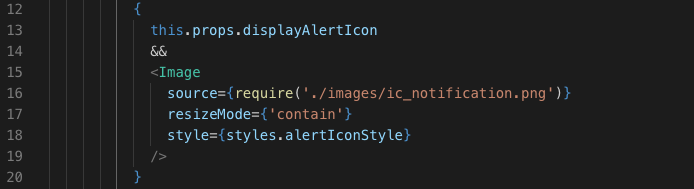
This change will display alert icon only if propType displayAlertIcon is passed true from specific screen on our app. If we pass false, then alert icon will not get displayed.
Same thing will be applying for the positive and negative button using props displayPositiveButton and displayNegativeButton. We’ll do the changes same as we’ve done with alert icon. Now to display alert title and message as specified in the props we’ll pass props in place of static content as shown below.
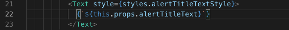
Same way does the changes for alert title and message. From our design we notice that title in our view is not in exact center as we’ve placed icon to the left of it. So, to make it in center you can give paddingRight to <Text/> component styles. Give padding to the number till title looks in the center. For now, we’ll change textAlign property to justify for title style. To look it appropriate, reduce height & width of the alert icon equal to 35. Also, change alert message text padding parameter to paddinHorizontal equals to 6 and add paddingVerticle equals to 2. At last, add width parameter for positive and negative button style with value equals to ‘30%’.
Next, wrap our whole returning view of CustomAlertComponent inside a single View component and specify styles as given below for it.
mainOuterComponent: {
flex: 1,
alignItems: ‘center‘,
justifyContent: ‘center‘,
backgroundColor: ‘#00000088’
}
Next, we’re going to wrap above specified View component inside a Modal component but first we need to import it for our class. Import it and we’ll make changes as below code.
<Modal
visible={this.props.displayAlert}
transparent={true}
animationType={“fade“} >
<View style={styles.mainOuterComponent} >
.
. . . . . component designed in part 2
.
</View>
</Modal>
Here, we have specified visible property for Modal component which will make sure weather to display it or not. Property transparent with value true makes surrounding background transparent. Property animationType specifies how this Modal component animate when it’s get displayed to the user.
So, here we’re done with our CustomAlertComponent designing part and now we’ll make changes to our App.js file. Here we’ve to pass declared propTypes of CustomAlertComponent where we’ve used it. So do the changes as below code and run your application to see changes.
<CustomAlertComponent
displayAlert={true}
displayAlertIcon={true}
alertTitleText={‘Alert Title from Props’}
alertMessageText={‘Alert message from props’}
displayPositiveButton={true}
positiveButtonText={‘OK’}
displayNegativeButton={true}
negativeButtonText={‘CANCEL’}
/>
WOW..!
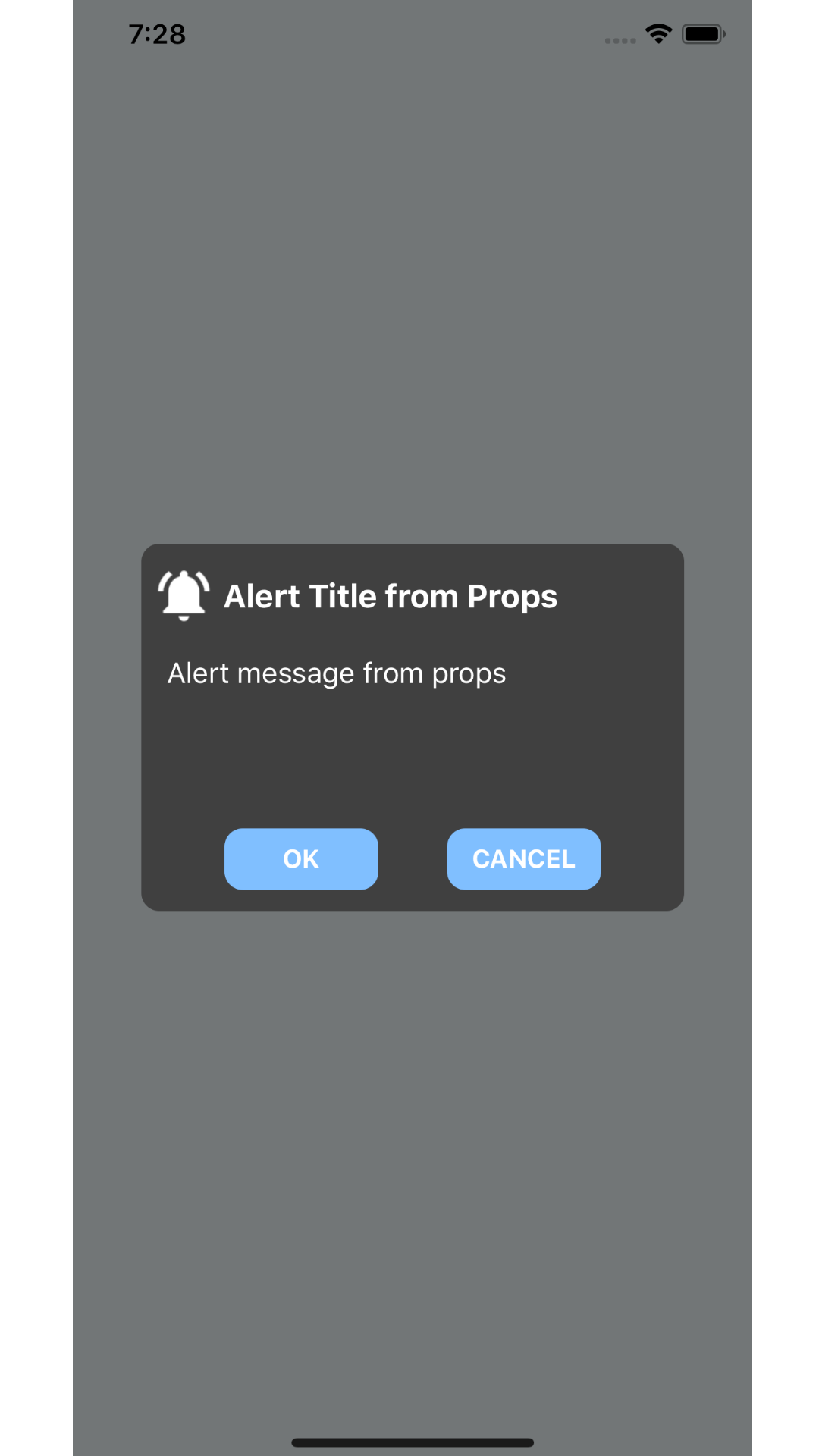
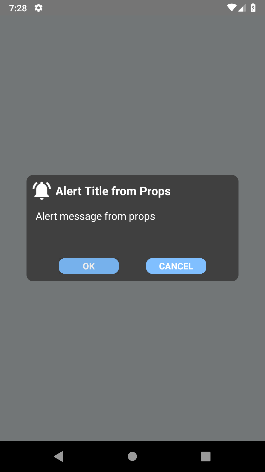
So, this is what we’re working from beginning. Do some changes with the props that we’ve passed to the CustomAlertComponent and check how it take effects. What is still left that we’ve to manage positive and negative button action when user taps on it. In our next part we’ll figure that out.
SECTION . 3
In previous two parts, we understand the requirement of designing CustomAlertComponent, structure of it. Then we started designing required structure and complete the designing part. If you haven’t refer them then please do check once.
In this part, we’re going to take positive and negative buttons to take effect for user actions. To make it happen, inside CustomAlertComponent class speciify onPress method for both of this component as below code.
<TouchableOpacity
onPress={this.onPositiveButtonPress}
style={styles.alertMessageButtonStyle} >
<Text style={styles.alertMessageButtonTextStyle}>{this.props.positiveButtonText}</Text>
</TouchableOpacity>
Specify onPositiveButtonPress method before where render function called inside class as below code.
onPositiveButtonPress = () => {
this.props.onPressPositiveButton();
};
Function that we’ve specified as props for this method is what we have to specify inside PropTypes for our CustomAlertComponent as below code.
onPressPositiveButton : PropTypes.func,
Same things we’ve to do for negative button so do changes as we’ve done with the positive button. Here what we’ve specified is, when user clicks on any of the button specific function gets called that is bind to the propTypes of this component from our main App.js file.
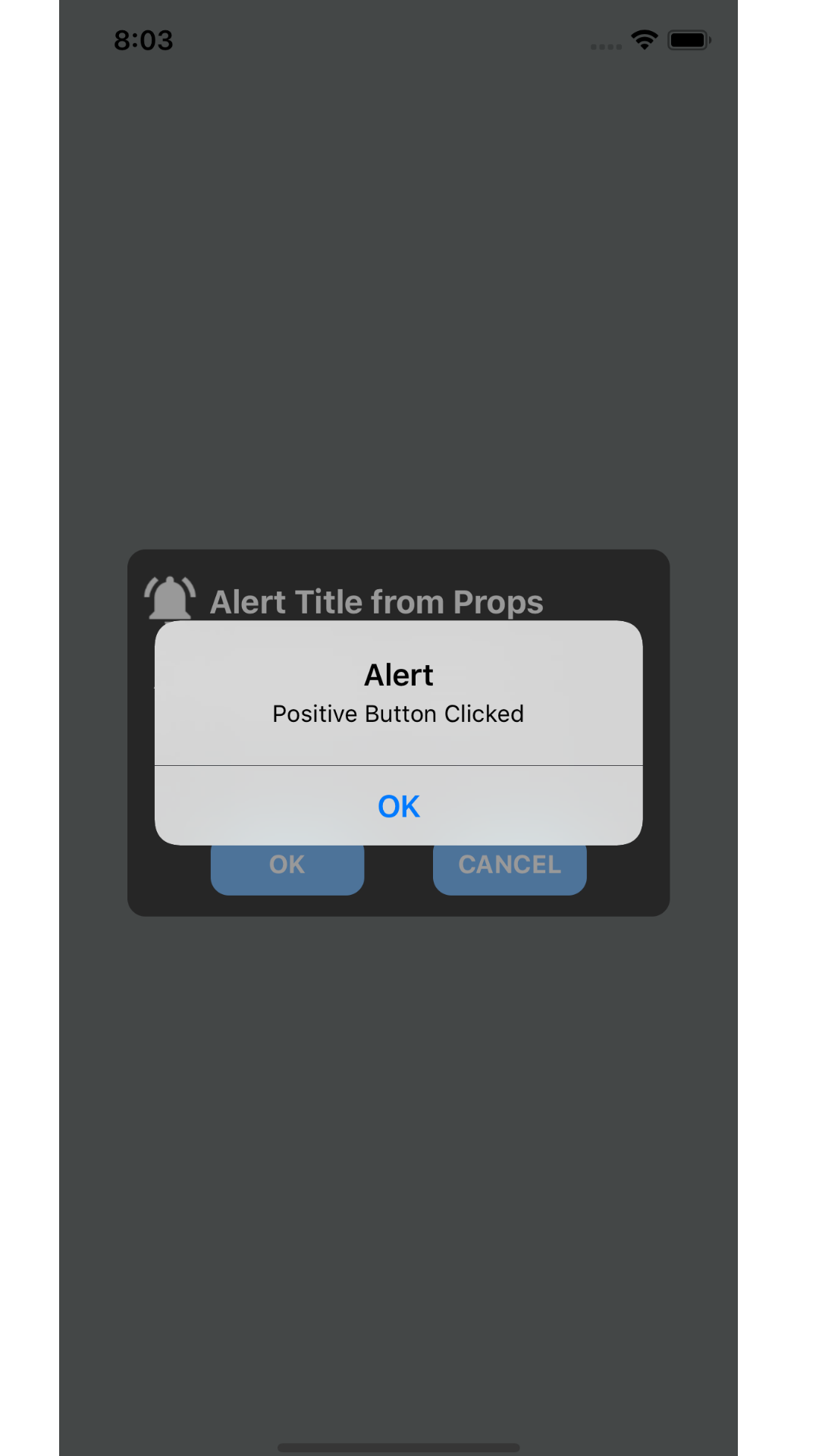
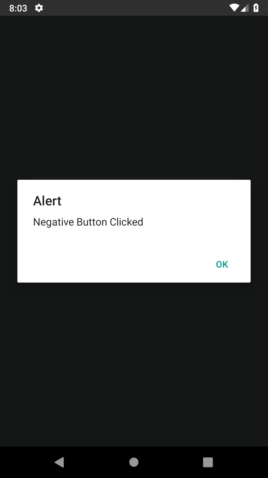
Now, here we’re done with the CustomAlertComponent coding and going to make final changes in App.js file. Inside app.js file we’ve to specify two function that will get called for positive and negative button. So, declare two function as below code.
onPressAlertPositiveButton = () => {
alert(‘Positive Button Clicked’);
};
onPressAlertNegativeButton = () => {
alert(‘Negative Button Clicked’);
};
With this we’ve to specify constructor that will bind above methods as below code.
constructor(props) {
super(props);
this.onPressAlertPositiveButton = this.onPressAlertPositiveButton.bind(this);
this.onPressAlertNegativeButton = this.onPressAlertNegativeButton.bind(this);
}
Final change that we’ve to do is to pass this function as props to CustomAlertComponent where we’ve declared it. So, make final changes as below code and run our application.
<CustomAlertComponent
displayAlert={true}
displayAlertIcon={true}
alertTitleText={‘Alert Title from Props’}
alertMessageText={‘Alert message from props’}
displayPositiveButton={true}
positiveButtonText={‘OK’}
displayNegativeButton={true}
negativeButtonText={‘CANCEL’}
onPressPositiveButton={this.onPressAlertPositiveButton}
onPressNegativeButton={this.onPressAlertNegativeButton}
/>
Awesome right..!!
So do click on positive or negative button to see alert to make an effect and play around. Clicking on OK of alert will make it disappear.
So, this is what we planned to create in part 1, a CustomAlertComponent that displays dynamic title, message that we want to display to the end user. In next series we’ll make this component more useful by making positive and negative button responsible for different callbacks (events) as we require.
Whole project is available at this git repository:
Related Posts
Nothing found.
Let’s talk!
We’d love to hear what you are working on. Drop us a note here andwe’ll get back to you within 24 hours
You might also like
Stay ahead in tech with Sunflower Lab’s curated blogs, sorted by technology type. From AI to Digital Products, explore cutting-edge developments in our insightful, categorized collection. Dive in and stay informed about the ever-evolving digital landscape with Sunflower Lab.


