Managers now a days are busy with focusing on the productivity of the company and the biggest obstacle in their way is dealing through tons of boring reports. This disrupts the efficiency of their work and slows down the whole process. To overcome this challenge, we provide Microsoft Power BI Dashboard Development Services which enables hr professionals in better visualisation of all the reports.
Whether they are attendance reports, New Hire reports, Separation between Former and Current Employees or Salary Reports , Power BI dashboards helps in visibility with detailed information and helps human resources department to make informed decisions.
In this blog, we have detailed down on different dashboards which might help you trace employee data and lead a thorough analysis.
Objectives
- Integration with multiple data sources like Excel file, Power BI Datasets, SQL Server, etc. for a holistic view of workforce data
- Built on the secure and reliable Microsoft Platform
- Streamlines Reporting Process
- Customizable to meet the specific needs of your organization
- AI-enabled to provide insights and predictions for HR 4.0
- Real-time monitoring capabilities for timely decision-making
- Visualization of gender and racial diversity through graphs and charts in Power BI
- User Friendly Interface
- Track Key HR Metrics
Creating Interactive Dashboards for HR Reporting in Power BI
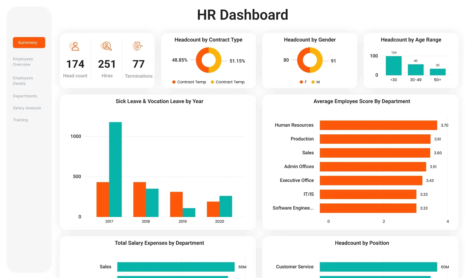
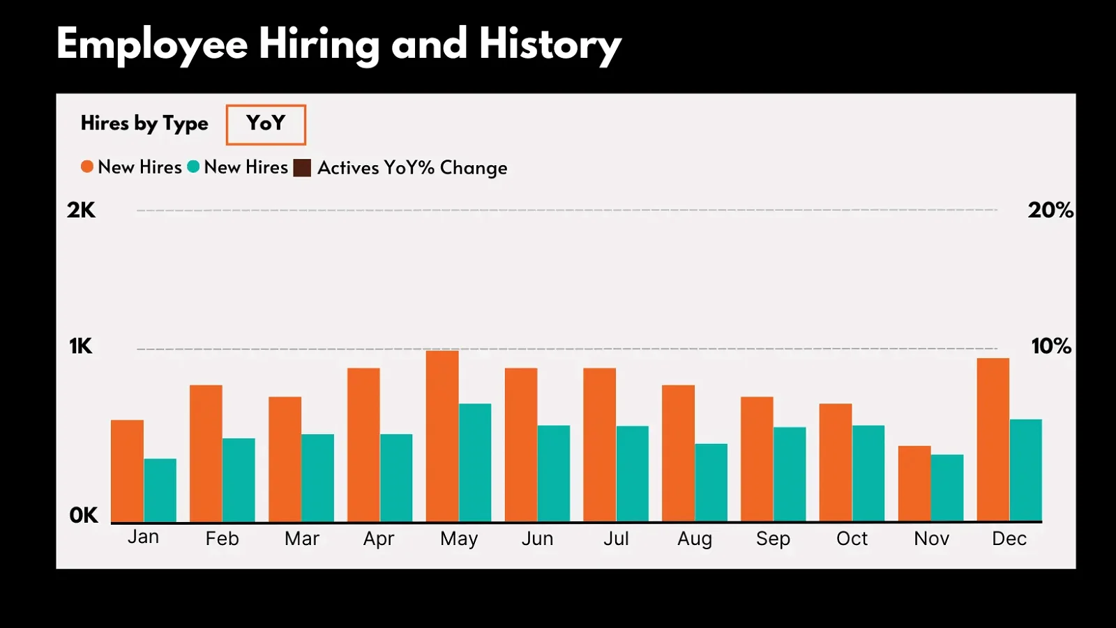
New hires
This Power BI HR dashboard focuses on tracking the volume and quality of new talent joining your team. It typically includes metrics such as the number of new hires, their demographics (e.g., age, gender, ethnicity), source of hire (e.g., internal referrals, job boards, social media), time to hire (i.e., how long it takes to fill a vacant position), and satisfaction ratings from both new hires and hiring managers. This helps in creating new hiring strategy, identifying areas for improvement in the recruitment process, and ensuring that the organization attracts and retains top talent effectively.
Features
This Power BI HR dashboard focuses on tracking the volume and quality of new talent joining your team, facilitating a streamlined approach to recruitment and onboarding. Features such as easy access to basic employee details, mobile accessibility, and year-over-year comparison enable HR professionals to make data-driven decisions to optimize the hiring process. By analyzing new hire demographics and satisfaction ratings, organizations can refine their recruitment strategies, ensuring the attraction and retention of top talent.
- Employee Information:-Easy access of basic details of new hires such as name, position, department, start date, and contact information.
- Mobile Accessibility:-Ensuring that the dashboard is accessible via mobile devices, allowing HR professionals and managers to track new hires’ progress on-the-go.
- Year-over-Year (YoY) Comparison:-Allows users to compare the number of new hires in the current year with the number from the previous year to assess hiring trends.
- Increment Analysis:-Enables HR professionals to assess individual employees’ work performance visualized using a column chart and determine appropriate salary increases based on their performance evaluations.
- Hover Details:-Enables users to hover over elements within the visualizations to view detailed information, such as the exact number of new hires for a specific category or period.
- Filtering Capability:-Allows users to select specific elements within the “New Hires” visualization to filter other visualizations on the dashboard accordingly like “Gender or Age Group. This helps in analyzing how hiring trends vary based on age group and gender.
- Data Security:-Implementing appropriate security measures to safeguard sensitive employee information like Location or SSN and ensure compliance with data protection regulations.
Separation dashboard - Active v/s Former Employee
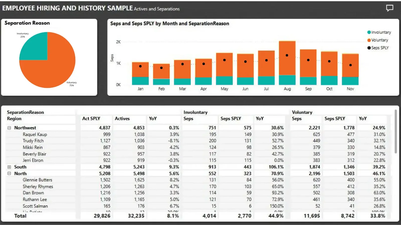
This dashboard allows you to compare and analyze retention and turnover rates within your organization. It typically includes measures such as total number of employees, employee turnover rate (both voluntary and involuntary), average tenure, reasons for leaving, and retention rates by department or job role.
Features
By comparing and analyzing retention and turnover rates, this dashboard empowers HR managers to identify trends and patterns in employee separations. The ability to check separations by type, compare separations by month to the previous year, and analyze specific separation factors facilitates proactive measures to address retention challenges. Through in-depth exploration of separation data, organizations can implement targeted interventions to improve employee retention, enhancing operational success and reducing recruitment costs.
- Check separations by type (voluntary or involuntary) using the donut chart:- The donut chart in the Separation Dashboard displays a breakdown of separations by type, distinguishing between voluntary and involuntary separations. This visualization provides a quick overview of the reasons employees are leaving the organization.
- Compare separations by month to the previous year:- Another feature of the Separation Dashboard allows you to compare separations by month to the previous year. This comparison helps identify trends and patterns in separation rates over time, enabling HR professionals to understand if separations are increasing or decreasing year-over-year.
- Analyze specific months or types of separation:- In the Separation Dashboard, you can drill down into specific months or types of separation for more detailed analysis. For example, you can focus on a particular month to identify any spikes in separations or analyze voluntary separations in more detail to understand the underlying reasons.
- Explore data using matrix view or other visualizations:- The Separation Dashboard offers various visualizations and views to explore the data further. For example, you can switch to a matrix view to see a detailed breakdown of separations by different factors such as department, location, or job level. Alternatively, you can explore the data using other visualizations such as bar charts or line graphs to gain additional insights.
Salary Analysis
This dashboard helps ensure equitable compensation across all levels of the organization by analyzing salary data. It typically includes metrics such as average salary by job title, salary distribution by department or location, and gender pay gap analysis.
Features
This dashboard ensures equitable compensation across all levels of the organization, contributing to employee satisfaction and retention. Features such as salary distribution visualization and integration with HR systems enable HR professionals to align compensation practices with organizational goals and market trends. By analyzing employee demographics and salary structures, organizations can identify and address disparities, fostering a fair and competitive compensation framework that enhances employee engagement and organizational performance.
- Salary Distribution:- Utilizes bar charts or histograms to visually represent the distribution of salaries across different job roles, departments, or experience levels within the organization.
- Salary Distribution:- Utilizes bar charts or histograms to visually represent the distribution of salaries across different job roles, departments, or experience levels within the organization.
- Employee Demographics:- Bar charts, pie charts, or treemaps can be used to analyze salary data based on employee demographics such as age, gender, education level, and location, providing insights into any demographic trends or biases.
- Integration with HR Systems:- Integrating with other HR systems or databases to ensure seamless data flow and synchronization of salary-related information.
- Salary Structure Visualization:- Visual representations of the organization’s salary structure, including base salary, bonuses, incentives, and other compensation components.
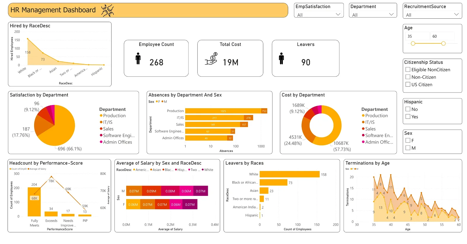
Workforce Demographics Dashboard
This dashboard provides a panoramic view of your employee distribution by demographic factors such as age groups, gender, ethnicity, education level, and job role. It allows HR professionals to monitor the diversity and inclusion of their workforce, identify areas where diversity efforts may be needed, and track progress over time.
Features
By providing insights into employee distribution by demographic factors, this dashboard promotes diversity and inclusion within the organization. Features such as educational background analysis and gender diversity visualization facilitate the monitoring of diversity initiatives and progress over time. By leveraging data on remote work status and employee turnover rates, organizations can implement targeted strategies to foster an inclusive workplace culture, driving employee satisfaction, retention, and operational success.
- Educational Background:- Bar chart or pyramid chart showing the distribution of employees based on their educational qualifications, indicating the level of educational attainment within the workforce.
- Employee Distribution by Age:- Bar chart or pie chart to visualize the distribution of employees across different age groups, highlighting the age diversity within the organization.
- Gender Diversity:- Pie chart or stacked bar chart to illustrate the gender distribution within the workforce, indicating the proportion of male and female employees.
- Ethnicity and Cultural Diversity:- Treemap or stacked bar chart to represent the diversity of employees based on ethnicity or cultural background, providing insights into the organization’s inclusivity efforts.
- Remote Work Status:- Pie chart or donut chart indicating the proportion of employees working remotely versus those working onsite, reflecting the organization’s remote work policies and practices.
- Employee Turnover Rates:- Line chart or waterfall chart displaying trends in employee turnover rates over time, indicating the stability of the workforce and potential areas of concern.
Employee Absences Dashboard
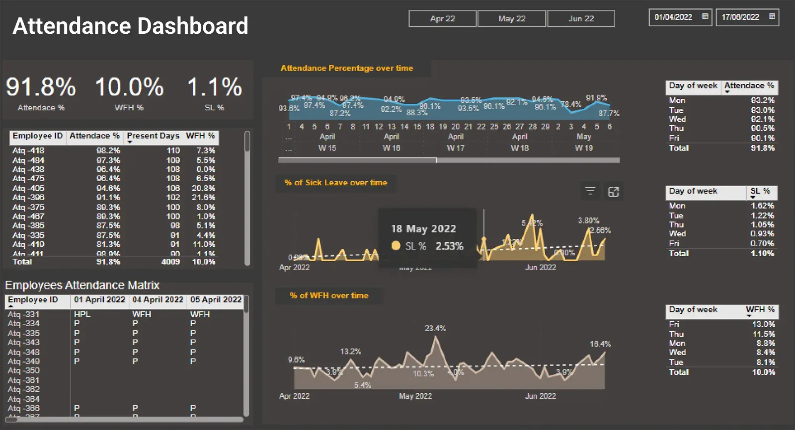
This dashboard helps identify patterns in employee absences and mitigate productivity loss. It typically includes metrics such as absenteeism rate, reasons for absence (e.g., illness, vacation, personal reasons), and trends over time. By analyzing this data, HR professionals can identify potential causes of absenteeism, such as high workload, poor work-life balance, or health issues, and implement strategies to address them.
Features
This dashboard helps identify and mitigate factors contributing to absenteeism, enhancing workforce productivity and operational efficiency. Features such as absence overview and trend analysis enable Human Resources to identify patterns and underlying causes of absenteeism. By analyzing absence rates by employee tenure and forecasting future absence trends, organizations can implement preventive measures and support mechanisms to improve employee well-being and reduce productivity loss due to absences. Through proactive management of absenteeism, organizations can optimize operational performance and employee engagement.
- Absence Overview:- Provides a high-level summary of overall employee absences, including total absences, average duration, and frequency. Chart type: Pie chart or donut chart for visualizing the distribution of absence types (e.g., sick leave, vacation, personal leave).
- Absence Trends:- Displays historical trends of employee absences over time using area chart to identify patterns and seasonality.
- Absence by Department:- Bar chart or stacked bar chart can be used to analyze employee absences based on different departments or teams within the organization.
- Reasons for Absences:- Breaks down employee absences by reasons such as illness, family emergencies, appointments, etc.
- Absence Rates by Employee Tenure:- Analyzes how absence rates vary based on employees’ length of service or tenure with the company. Chart type can be scatter plot or grouped bar chart comparing absence rates against tenure categories.
- Absence Costs:- Calculates the financial impact of employee absences on the organization, considering factors like salary, productivity loss, and replacement costs. Chart type: Stacked column chart or waterfall chart illustrating the cost breakdown of absences.
- Absence Forecasting:-Predicts future absence trends based on historical data and relevant factors like seasonality or upcoming holidays.
Innovating Healthcare & Manufacturing Industries
Check our Power BI Dashboard Development Solutions now!
Case Study: Utilizing Power BI for Candidate Screening
Imagine you’re an HR Manager tasked with finding suitable candidates for a job role. Leveraging automation, you’ve sifted through LinkedIn profiles and shortlisted 100 candidates. These profiles are then processed through a machine learning model incorporating Natural Language Processing (NLP) for text conversion and vectorization. Through predictive analysis, the NLP model categorizes candidates, with 60% deemed irrelevant and 40% relevant to the job role.
The outcomes of this analysis generate a report, which serves as the data source for Power BI. Automation seamlessly uploads this data into Power BI, where it’s visualized in a dashboard featuring pie charts or other relevant visuals. This dashboard provides a comprehensive view, aiding in decision-making and streamlining the candidate selection process.
Tips for Choosing a Power BI Development Service Provider
When selecting a Power BI development service provider, it’s essential to consider several factors to ensure you find the right partner for your business needs. Here are some key tips to guide your decision-making process:
- Expertise and Experience: Look for a service provider with extensive expertise in Power BI development, including proficiency in data modeling, visualization design, and dashboard creation. Sunflower Lab has excellent Power BI Experts whose expertise is clearly visible in our projects like AMOT, MAI, PCP and ZinniaX.
- Industry Specialization:Choose a provider that has experience working within your industry or niche. Indeed, industry-specific knowledge can be invaluable in understanding your unique data requirements, compliance standards, and business challenges and we can totally vouch for our Power BI Dashboard Development in Healthcare and Manufacturing.
- Customization and Flexibility:Look for a service provider that offers customizable solutions tailored to your organization’s requirements and objectives. Avoid one-size-fits-all approaches and prioritize providers who are willing to adapt their services to meet your unique needs. One must always focus on long term scalable solutions.
- Pricing Models and Cost Transparency:Compare pricing models such as fixed-rate projects, hourly rates, or subscription-based pricing. Look for transparency in pricing and billing practices to avoid unexpected costs. Ensure that the provider provides detailed estimates and clearly outlines the scope of work covered by the proposed pricing.
- Integration Capabilities:Assess the provider’s ability to integrate Power BI solutions with your existing systems, data sources, and workflows. Look for experience in integrating Power BI with other Microsoft products and third-party applications commonly used in your organization, such as CRM systems, ERP software, or cloud platforms.
Future Trends in Power BI Development
Emerging trends in Power BI development are shaping the future of analytics by making data more accessible, actionable, and impactful for organizations across industries.
AI-Powered Analytics
AI and machine learning capabilities are increasingly being integrated into Power BI to enhance data analysis and decision-making processes. AI-powered features, such as natural language processing (NLP), anomaly detection, and automated insights generation, enable users to derive actionable insights from their data more efficiently. Predictive analytics algorithms, including regression analysis, classification models, and time series forecasting, empower organizations to anticipate future trends and make proactive decisions.
Augmented Analytics
Augmented analytics combines AI and analytics to automate data preparation, insight discovery, and interpretation tasks, reducing the need for manual intervention. Natural language querying (NLQ) allows users to interact with data using everyday language, making insights accessible to non-technical users.
Predictive Modeling
Predictive modeling capabilities in Power BI enable users to build and deploy machine learning models directly within the platform. Integrated model training and evaluation tools simplify the process of developing predictive models, allowing users to leverage historical data to make accurate forecasts.
Data Governance and Compliance
Power BI is enhancing its capabilities for data governance, including improved data lineage, metadata management, and access controls. Compliance features, such as data encryption, role-based access control (RBAC), and audit logging, ensure that organizations can meet regulatory requirements and protect sensitive data.
Embedded Analytics
Embedded analytics allows organizations to integrate Power BI reports and dashboards directly into their applications, portals, and websites.
Power BI Embedded provides developers with APIs and SDKs to embed interactive data visualizations seamlessly into custom applications, extending the reach of analytics capabilities.
Hybrid and Multi-Cloud Deployments
With the increasing adoption of cloud technologies, organizations are exploring hybrid and multi-cloud deployments for their Power BI solutions. Power BI supports hybrid architectures, allowing organizations to connect to on-premises data sources while leveraging cloud-based analytics capabilities. Multi-cloud deployments enable organizations to leverage multiple cloud providers for their analytics needs, providing flexibility and scalability.
HR Power BI Dashboards: Metrics and KPIs
- Employee Turnover Rate: This metric measures the percentage of employees who leave the organization over a specified period. It helps HR professionals understand retention trends and identify areas for improvement in employee engagement and satisfaction.
- Time-to-Fill: This metric calculates the average time it takes to fill vacant positions within the organization. It helps HR teams assess the efficiency of their recruitment process and identify bottlenecks that may be causing delays in hiring.
- Cost-per-Hire: This metric calculates the average cost incurred to hire a new employee, including expenses related to recruitment advertising, agency fees, and employee onboarding. It helps HR teams optimize their recruitment budget and assess the effectiveness of different sourcing channels.
- Employee Engagement Score: This KPI measures the level of employee engagement and satisfaction within the organization. It may be based on employee surveys or other feedback mechanisms and helps HR professionals track changes in employee morale over time.
- Absenteeism Rate: This metric measures the percentage of scheduled work hours that employees are absent from work due to unplanned reasons, such as illness or personal reasons. It helps HR teams identify trends in employee absenteeism and implement strategies to improve attendance.
- Training and Development ROI: This KPI calculates the return on investment (ROI) of training and development programs by comparing the cost of training to the improvement in employee performance or productivity. It helps HR professionals assess the effectiveness of training initiatives and allocate resources accordingly.
- Diversity and Inclusion Metrics: These metrics track the representation of diverse groups within the workforce, such as gender, ethnicity, and age. They help HR teams measure progress toward diversity and inclusion goals and identify areas for improvement in recruitment and retention practices.
- Performance Management Metrics: These metrics assess employee performance and productivity, including metrics such as performance ratings, goal achievement, and 360-degree feedback scores. They help HR professionals identify high-performing employees, assess performance trends, and support talent development initiatives.
- Benefits Utilization Rate: This metric measures the percentage of employees who enroll in and utilize company benefits, such as health insurance, retirement plans, and wellness programs. It helps HR teams assess the effectiveness of benefits offerings and identify opportunities to improve employee satisfaction and retention.
- HR Budget vs. Actuals: This metric compares the HR department’s budgeted expenses to actual expenditures, helping HR professionals track spending and ensure budget compliance.
How to create an HR dashboard in Power BI?
Power BI | Power Query | Dax Query
Building your HR dashboard with Power BI can transform the complex task of data analysis into a streamlined, accessible process:
- Gathering and Storing Your Data: Firstly, Our Power BI Experts connect your HR data sources (HRIS software like ADP Workforce Now, Oracle HCM Cloud, SAP SuccessFactors or Payroll Systems like Gusto, Paychex, QuickBooks Payroll or any other data sources) to data storage points like SQL, Sharepoint, dataverse, etc).
- Data Transformation and Preparation: By leveraging Power Query, we make uniform data adjustments across your reports. For example, removing duplicates, renaming columns, and changing data types or creating specific conditions for the data based on custom conditions.
- Analytical Crafting: With DAX queries, we can analyze HR data to generate insights and enhance dashboard KPIs in Power BI. We create measures and columns using functions like COUNT and SUM to manipulate and explore clean data effectively. This allows us to identify areas for improvement and visualize insights for HR analytics.
- Visualization: By choosing from a range of charts like Bar chart, Pie chart, Matrix chart, Column chart, Cards, Donut chart, Line chart etc. and filters, your data displayed effectively.
- Security Configuration: Setting up role-based access controls (RBAC) in Power BI. We apply data sensitivity labels and enforce governance policies.
- Deployment: Publishing the Power BI reports and dashboards to Power BI Service. Share with relevant stakeholders and configure scheduled refreshes for real-time data updates
- Maintenance and Monitoring: Monitoring report usage and performance. Update and maintain the system according to evolving business needs and feedback.
- Predictive Analytics: Employ Power BI’s predictive analytics to foresee trends and patterns, powering proactive HR strategies.
Power BI and Automation
Power BI is a powerful business intelligence tool that enables organizations to visualize and analyze their data to gain valuable insights. When combined with automation, Power BI becomes even more effective in streamlining processes, reducing manual effort, and improving overall efficiency. Here’s how Power BI and automation work together:
1. Data Refresh and Integration
- Power BI allows users to connect to various data sources, such as databases, cloud services, and APIs, to import data into their reports and dashboards.
- Automation tools can be used to schedule regular data refreshes, ensuring that reports are always up-to-date with the latest information.
- By automating the data integration process, organizations can reduce manual effort and ensure data consistency across reports.
2. Report Generation and Distribution
- Power BI enables users to create interactive reports and dashboards that provide insights into key business metrics and Key Performance Indicators.
- Automation can be used to schedule the generation of reports and distribute them to stakeholders via email or other communication channels.
- By automating report generation and distribution, organizations can ensure that decision-makers have access to timely insights without having to manually access the reports.
3. Data Transformation and Cleaning
- Power BI provides capabilities for data transformation and cleansing, such as data modeling, filtering, and aggregation.
- Automation tools can be used to automate these processes, reducing manual effort and ensuring consistency in data preparation.
- By automating data transformation and cleaning, organizations can improve the quality of their data and accelerate the analysis process.
4. Alerts and Notifications
- Power BI allows users to set up alerts and notifications based on predefined conditions, such as threshold values or data anomalies.
- Automation can be used to trigger these alerts and notifications automatically, allowing stakeholders to take action in real-time.
- By automating alerts and notifications, organizations can proactively monitor key metrics and respond quickly to changes in their data.
4. Integration with Workflow Tools
- Power BI can be integrated with workflow automation tools, such as Microsoft Power Automate or Zapier, to automate actions based on insights from reports and dashboards.
- For example, workflows can be triggered based on changes in KPIs or trends identified in the data.
- By integrating Power BI with workflow tools, organizations can streamline their processes and improve overall efficiency.
Conclusion
In conclusion, leveraging Microsoft Power BI for HR dashboard development offers a transformative solution to the challenges faced by HR professionals in managing workforce data effectively. By integrating multiple data sources, streamlining reporting processes, and providing customizable, AI-enabled dashboards, Power BI empowers HR teams to gain valuable insights and make informed decisions to drive organizational success.
From tracking new hires and analyzing workforce demographics to monitoring employee absences and conducting salary analysis, Power BI dashboards offer a comprehensive solution to meet the diverse needs of HR departments. With features such as interactive visualizations, real-time monitoring capabilities, and user-friendly interfaces, Power BI enables HR professionals to access and analyze critical HR measures with ease.
Drive Success with Our Tech Expertise
Sunflower Lab is a leading Power BI Desktop & Power BI Development Service Provider. Our exceptional Power BI Experts helped with numerous clients like AMOT & PCP to achieve their desired satisfaction levels in Power BI Manufacturing Dashboard. Contact Us today to simplify your Report Analysis journey with easy and interactive Visualization of Report. Our team will be delighted to discuss with your further.
You might also like
Stay ahead in tech with Sunflower Lab’s curated blogs, sorted by technology type. From AI to Digital Products, explore cutting-edge developments in our insightful, categorized collection. Dive in and stay informed about the ever-evolving digital landscape with Sunflower Lab.